Advanced Motion (Final Project)

Reading & Writing

The final chapter in Liz Blazer’s Animated Storytelling, entitled “Show and Tell,” covers all that it takes to get your project out there. Once your film is complete, it’s time to get it out there! Here, Blazer provides her readers with details and considerations to make surrounding packaging a project, submitting to festivals (or not), networking, and sharing. My favorite tips from this chapter are the ones regarding networking.

Often, upon completing a project, we jump straight into sharing the entire project, expecting that others will see it, engage with it, and, hopefully, share it. Surprisingly, Blazer encourages her readers to first connect with peers. This includes like-minded artists, as well as people that “share a common thread with the story” of your work. Blazer’s next tip is to “Be a Good Audience.” It’s important to be supportive of other peers, as what goes around comes around. Building rapport and relationships with other individuals will likely result in genuine feedback and support when it’s your turn to share. Furthermore, Blazer stresses that self-promotion is successful in moderation and the proper settings. 

Another key part of networking involves splicing up your work, sharing it in bits and pieces. Blazer suggests teasing your work out over time to pique the interest of others so that they are requesting to see it. After sharing bits of the project, share the whole thing and ask for feedback. Finally, networking in person can be highly beneficial. Get comfortable in your own skin and don’t be afraid to put yourself out there. You never know what can happen.

Blazer closes the chapter with one last encouragement, “never stop.” She describes being an artist as a “constant itch” that needs to be scratched. When the itch returns, it’s time to start the process again with a new project and a fresh idea.

Overall, as a creative person, Animated Storytelling has been informative and inspirational from start to finish. I loved Blazer’s writing style and her funny little stories and scenarios. She consistently supported her work with examples and offered great tips and advice along the way. The most important thing I learned through reading this book was to be intentional in practice with all projects. Every step of developing a project involves a tool or practice that will help refine and support the story while keeping things organized. From creating a creative brief to elevator pitches, sketching, storyboarding, selecting audio, you name it, Blazer provided me with a distinct strategy to create a solid project without it feeling overwhelming or intimidating. 

Research

When working with motion and/or animation, the possibilities are endless. Here are some examples of phenomenal uses of motion, effects, and animation.

Between 2020 and the beginning of this year, my husband and I played parts one and two of a video game called The Last of Us. I always wondered how some of the scenes were created, but never took the time to look into it until now. Here’s some paralleled footage of motion-captured scenes used to create scenes from the game. The quality and editing aren’t the best, but, having played the games, I can appreciate the work that goes into creating it.

This Yoplait commercial uses animation to advertise their products creatively and expressively. The ad maintains real representations of the yogurt and gogurt moving through a playful, colorful, paper-like world. The transitions between scenes are quick, yet engaging and well-thought out. 

Adobe is the most recognized creative software company, so it’s only fitting that their advertisements incorporate motion, animation, and special effects all at once. If you happen to catch their latest Premiere Pro ad on YouTube, check it out.

Create

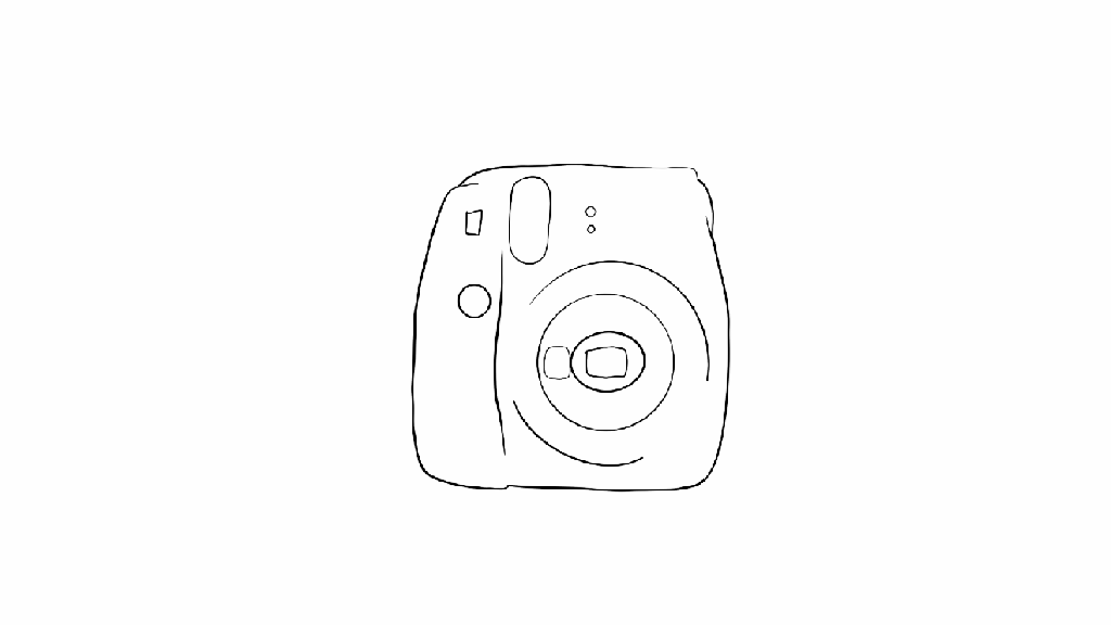
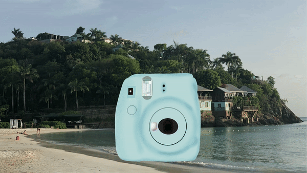
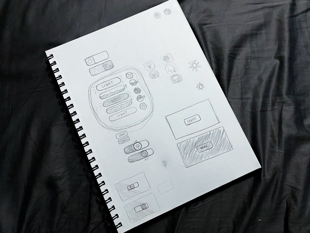
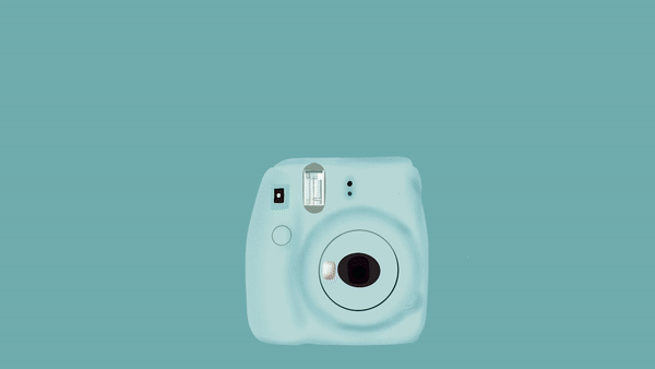
Initially, I had a few ideas floating around for my final project. I settled upon revisiting my onion-skinned animation from Module 1 and revamping it with some of the skills I have acquired throughout this course. I took the first frame of my outlined Instax camera, created in Photoshop, and utilized Procreate to add color and polish it. Next, I challenged myself to use animation assist, a Procreate feature, for the first time to animate a button push, flash, and the film coming out of the camera, frame by frame. In the succeeding frames, I scaled previous frames larger, little by little until they filled the screen, zooming into a photo containing my actual Instax camera. I made sure to line up the real Instax with the illustrated one. This allowed me to fade the real one out to reveal the illustration in the first frame, ending where we started.

Once all my frames were complete and the animation looped, I exported an mp4 and moved to Premiere Pro. Here, I added sound and reworked some of the zooming frames to make the movement smoother. Eventually, I had the bright idea to change the background to embody more of a beach/travel feel and help tie everything together, considering the oceanside soundtrack and the beach photo within the film. Unfortunately, I created my frames in Procreate using solid backgrounds within each frame. Revisiting the background within my animation meant removing the background I had already created. I opted to try it anyway and further familiarize myself with the program. This time around, I moved faster and ended up with two variations of the animation that I appreciate equally.

Working between two programs prompted me to consider all the software I’ve utilized during this course. I find that each program is unique, housing distinct strengths and weaknesses. A zooming effect may appear to be choppy using Procreate’s animation assist. However, zooming using the scale and position keyframes in Premiere Pro would result in a much smoother motion. Due to the various projects I have completed within this course, I now have a better idea of which programs may suit me best for any given project. Furthermore, my skill and knowledge levels have increased alongside my confidence in myself as a creator of motion-related media. I really enjoy animation and motion graphics and, in the future, I look forward to experimenting with more styles and mediums and potentially introducing them into my daily work as a graphic designer.

Module Six: Interface Motion (User Interface Animation)

A gif of my final button animation

Reading and Writing

“Animate!” That’s the title of Liz Blazer’s tenth chapter in Animated Storytelling. In this chapter, we’re finally ready to get the animation show on the road. Blazer offers her readers wisdom and practical tips to ensure that the animation process will be a success. 

We start off with two important steps:

  1. Create a production calendar: Print a blank calendar and fill it in backward, starting with the delivery date and working back to pre-production. Once it’s complete, create a digital version for easy sharing.
  2. Protect ya’ tech: Stay organized by utilizing simple file names and folders. Save versions early and often. Finally, be sure to get a hard drive and back up your files daily.

Next, Blazer provides tips for starting the project. She encourages animators to start with the scenes that are the shortest, easiest, and most fun to animate. Additionally, she suggests breaking up tough scenes into smaller chunks that are easier to tackle. 

As every shot will not be included in the final animation, it is also important to become a brutal editor. This tip is especially relevant for me because I often have a tough time cutting out segments of my work that I have fallen in love with. To address this, Blazer implores the reader to question whether the shot is truly necessary. She states, “if you’re reluctant to edit the sequence because it’s your ‘coolest part,’ then definitely consider cutting it,” because it will likely take the most time and delay the production schedule. This tip was a timely reminder to avoid getting super attached to my creative work and remain flexible. 

Finally, Blazer closes the chapter by providing substantial advice regarding how to remain flexible regarding movement and sound within animation. 

Research

Gif created using animation video found on Career Foundry site

My first UI animation selection comes from Career Foundry. I love that all stages of the animation take place within one shape, yet the user is able to observe the progress and completion of their download. Each stage of the download has a distinct color paired with its own mini animation. The transition between each stage is quick and clean. 

Screenshot of falling stars from Aaron Iker’s rating animation

Aaron Iker has tons of UI animations on Dribbble. This particular animation allows the user to provide their rating, which is indicated by stars and the color yellow. Upon changing their rating, the stars that are removed return to the initial gray color, shatter, and fall off of the screen.

Screenshot of Shivam Kaushik’s upload animations on Dribble

Shivam Kaushik’s animation of an upload button shows us how one action can be animated successfully in multiple ways.

Screenshot of the menu button opening up from Oleg Frolov’s dribbble profile

Here, Oleg Frolov cycles between an open and closed menu with one click. The downward arrow duplicates its stems, rotating them downwards to form an “x.” The “x,” in turn, folds those stems upwards to return to its initial state.

Screenshot of Saavan Ch’s second upload animation on Behance

Finally, moving to Behance, Saavan Ch provides four examples of how an upload can be achieved, using the same base shapes, but different animations. His second upload animation was a source of inspiration for my own creation.

Create

This week, I created a UI animation of my own. In the past few years, dark mode has become a popular feature amongst users of various social media platforms, websites, and even smartphones. Primarily, this feature was created to protect users’ eyes. However, today, many users prefer dark mode for its sleek look and feel. Most of my closet is black and my devices are always the same color: Apple’s “space gray,” so it only makes sense that I prefer dark mode over light. I found it fitting to create a dark and light mode button animation.

Brainstorming sketches of my dark/light mode button animation

I started my process with a pencil and sketchbook, which allowed me to explore multiple button shapes, varied symbol representations for the two modes, and a few ideas surrounding the transitions between modes. After trying a few different approaches, I determined that my button would be a circle that toggles between a moon icon for dark mode and a sun icon for light. When transitioning from light to dark, the button would fill with the dark mode color in a fluid-like manner from bottom to top. When transitioning from dark to light, the button would do the opposite.

Dark and Light Mode Button Animation, created in Adobe After Effects

Sketching my ideas before moving to After Effects helped my animation process progress very smoothly. The only challenges I faced while developing my animation occurred toward the end when I made the decision to mask the moon and sun icons into a flat horizon as they popped up and down between button clicks. With a little research, I learned how to create masks on separate solid layers and apply alpha track mattes to each icon layer. 

My favorite part of creating this button animation was incorporating audio. Finding a mouse click sound effect was straightforward. To take the animation a step further, I wanted to include two additional sound effects to indicate that the user’s request was met. Finding two contrasting notification sound effects that were both positive in nature (for free) was a bit of a challenge. Thankfully, I was able to swing it. In my final animation, I paired the lighter, higher-pitched notification sound effect with the light mode setting, and the deeper sound effect with the dark mode setting. 

Altogether, I really enjoyed this project. I would love to explore alternative dark/light mode switch animations in the future. Additionally, I am open to creating UI animations in other softwares including Adobe XD and Figma.

Module Five: Motion for Promotion (Logo Stinger)

Reading & Writing

Chapter 9 of Animated Storytelling is called “Technique.” In this chapter, Blazer walks her audience through the final step before the animation begins. Animators often use the animation technique they are most familiar with. However, Blazer encourages the reader to step out of their comfort zone and explore all animation techniques, implementing the technique that pairs best with their storyline. 

This is accomplished by considering how the final animation will be viewed, aka the format. The next and most important consideration to take involves translating your story. During this step, it’s important to review your creative brief and consider techniques that embody the overall message and tone of the story. 

Once these considerations have been made, there are several techniques and visual styles to explore. Blazer progresses through the chapter by supplying the reader with descriptions of these techniques and styles. She encourages the reader to research examples of the technique/style they have chosen, seek inspiration, and adapt. 

Finally, we learn to be flexible and find a good workaround to making the animation a success. Here are the workarounds Blazer shared:

Workaround 1: Import Still Images

  • Making use of editing tools while working with still images inside your composition may end up feeling like full-on animation. 

Workaround 2: Shoot Live-Action Footage

  • Sometimes, if still images aren’t working, incorporating live-action footage into the project and processing and editing it in your program can result in a seamless animation.

Workaround 3: Staff Up

  • Outsourcing work can save a lot of time and effort. It’s always a relief to have help with a big project, and the creativity of other individuals can greatly benefit the final animation. 

Research

The following animated scenes utilize some of Frank Thomas and Ollie Johnston’s 12 principles of animation

Staging

This scene from Arthur uses staging to guide the viewer’s attention. The animation incorporates direct cuts from scene to scene to identify the main subject. Furthermore, the animators also intentionally pan from one area of the shot to the next, utilizing the setting, timing, camera position, and even the acting to capture the overall idea.

Squash and Stretch

Demon Slayer’s bouncing ball scene uses squash and stretch. This principle emphasizes the speed, flexibility, and momentum of the balls as they bounce throughout the house. 

Appeal

Foster’s Home for Imaginary Friends is full of appeal. Each character has a distinct appearance and character design that is interesting and intriguing to the audience. Although they are all drastically different, the common use of big, wide eyes makes each character likable. 

Solid Drawing

Sony’s Hair Love makes great use of solid drawing, utilizing weight and volume to bring each object and character to life, even down to Zuri’s hair. As Zuri, her cat, and her dad move throughout the house and are seen from varied angles and perspectives, their movements make you believe they exist within a three-dimensional space. 

Anticipation

Finally, anticipation is present throughout many Kim Possible fight scenes. Here, Kim and Shego consistently move into specific positions or stances in preparation to jump, strike or block their opponent. 

Create

Toward the end of 2020, I woke up with a crazy idea (as I often do). My idea was to start a podcast. Long story short, I have been planning, producing, and preparing to launch the first season of my podcast, called Feel My PainFeel My Pain is a podcast dedicated to providing an inside look into the daily experiences of individuals diagnosed with a rare blood disorder called Sickle Cell Disease, which causes chronic pain. I have Sickle Cell, and I am also connected to numerous people directly impacted by this disease. Through the years, I have come to learn that my counterparts have completely different experiences than me. Everyone’s journey is unique. 

As Feel My Pain develops, I hope to invite people with Sickle Cell and those directly connected to individuals with the disease to share their personal stories through an anonymous submission form. These submissions will be transformed into a storytelling experience in which the listener is granted the opportunity to assimilate the world of those with Sickle Cell and feel their pain. My ultimate goal for this podcast is to provide insight, increase understanding, and raise awareness for a medical condition affecting millions of people of color worldwide, including myself and my loved ones. 

Sometime in July, I created the look and feel for the podcast, including sans serif type, blacks, reds, whites, splashes of blood, and a few blood cells. A couple of months later, I created an Instagram page and started working on the website. Although I am starting with a podcast, I hope to branch out and develop a blog and YouTube page, utilizing these platforms to film the podcast and provide resources and educational information for those desiring to learn more about life with Sickle Cell. 

So, this week, when presented with the opportunity to animate a logo, I figured why not animate the Feel My Pain logotype for my future YouTube endeavors? Admittedly, though I am a graphic designer, I’m not a fan of logo creation; I do best with type. As of now, Feel My Pain does not have a logomark, but, being that this is a podcast, I think a logotype serves this purpose well. 

I initially created the podcast graphics in Adobe Illustrator and already had a few designs on artboards sized 1920×1080. After digging up the Illustrator file, I selected the designs I needed for this project and copied them into a new HDV Illustrator template. Next, I sorted the elements into 21 different layers, naming each layer based on its contents. After finalizing my Illustrator file, I imported it into After Effects as a composition, retaining the layer sizes. Next came animation!

My main challenge was finding a way to animate the Feel My Pain text interestingly and appropriately, considering my audience and the podcast topic. I decided to direct the viewer’s attention to the word “pain,” which captivates the podcast’s theme most. Outside of the words “the” and “podcast,” every letter within the design had its own layer, so I manipulated each of them, one by one. For the animated stroke effect, I created shape layers from vector layers, added strokes to each shape layer, and followed this tutorial to apply trim paths to the letters. There was definitely a learning curve concerning creating new shape layers and getting the strokes to move how I envisioned, as it required a lot of research, trial, and error. 

A second challenge arose when masking the blood in the top right and bottom left corners. I intended for the blood to emerge fluidly along the path of the blood’s shape, so I attempted to move the mask points frame by frame. However, my first few sets of masks moved very awkwardly. After a few attempts, I opted to create two large masks and gradually move them onto the screen to reveal the blood. I completed this part of the animation by sliding blood drops and a blood cell into the frame, holding the complete image for about a second, and fading everything to black. 

My initial composition animated each element right after the other with everything timed according to my observations and judgment. I selected a relaxed song with the potential to open up the podcast at full volume and then decrease when the dialogue starts, fading out completely or standing as subtle background music. After adding in my music selection, I moved things around further to time it better with the song. This resulted in the words and strokes moving at a slower pace and the blood animations occurring simultaneously. 

Altogether, I would like to explore more ways to animate type and blood. I think it would be nice to experiment with morphing the text or splattering the blood. I would also like to consider having a different animation and music selection for every season of the podcast.