
Reading and Writing
“Animate!” That’s the title of Liz Blazer’s tenth chapter in Animated Storytelling. In this chapter, we’re finally ready to get the animation show on the road. Blazer offers her readers wisdom and practical tips to ensure that the animation process will be a success.
We start off with two important steps:
- Create a production calendar: Print a blank calendar and fill it in backward, starting with the delivery date and working back to pre-production. Once it’s complete, create a digital version for easy sharing.
- Protect ya’ tech: Stay organized by utilizing simple file names and folders. Save versions early and often. Finally, be sure to get a hard drive and back up your files daily.
Next, Blazer provides tips for starting the project. She encourages animators to start with the scenes that are the shortest, easiest, and most fun to animate. Additionally, she suggests breaking up tough scenes into smaller chunks that are easier to tackle.
As every shot will not be included in the final animation, it is also important to become a brutal editor. This tip is especially relevant for me because I often have a tough time cutting out segments of my work that I have fallen in love with. To address this, Blazer implores the reader to question whether the shot is truly necessary. She states, “if you’re reluctant to edit the sequence because it’s your ‘coolest part,’ then definitely consider cutting it,” because it will likely take the most time and delay the production schedule. This tip was a timely reminder to avoid getting super attached to my creative work and remain flexible.
Finally, Blazer closes the chapter by providing substantial advice regarding how to remain flexible regarding movement and sound within animation.
Research
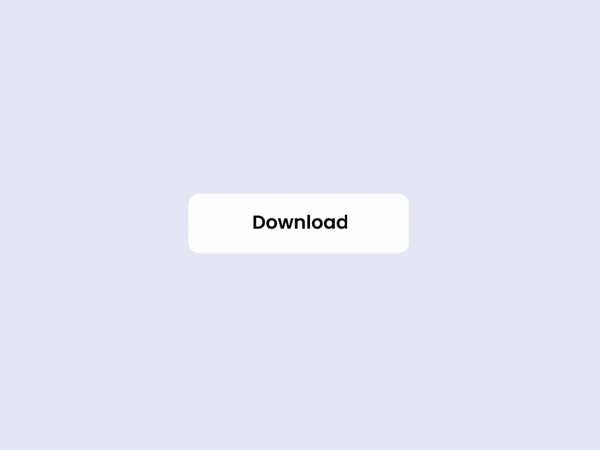
My first UI animation selection comes from Career Foundry. I love that all stages of the animation take place within one shape, yet the user is able to observe the progress and completion of their download. Each stage of the download has a distinct color paired with its own mini animation. The transition between each stage is quick and clean.

Aaron Iker has tons of UI animations on Dribbble. This particular animation allows the user to provide their rating, which is indicated by stars and the color yellow. Upon changing their rating, the stars that are removed return to the initial gray color, shatter, and fall off of the screen.

Shivam Kaushik’s animation of an upload button shows us how one action can be animated successfully in multiple ways.

Here, Oleg Frolov cycles between an open and closed menu with one click. The downward arrow duplicates its stems, rotating them downwards to form an “x.” The “x,” in turn, folds those stems upwards to return to its initial state.

Finally, moving to Behance, Saavan Ch provides four examples of how an upload can be achieved, using the same base shapes, but different animations. His second upload animation was a source of inspiration for my own creation.
Create
This week, I created a UI animation of my own. In the past few years, dark mode has become a popular feature amongst users of various social media platforms, websites, and even smartphones. Primarily, this feature was created to protect users’ eyes. However, today, many users prefer dark mode for its sleek look and feel. Most of my closet is black and my devices are always the same color: Apple’s “space gray,” so it only makes sense that I prefer dark mode over light. I found it fitting to create a dark and light mode button animation.
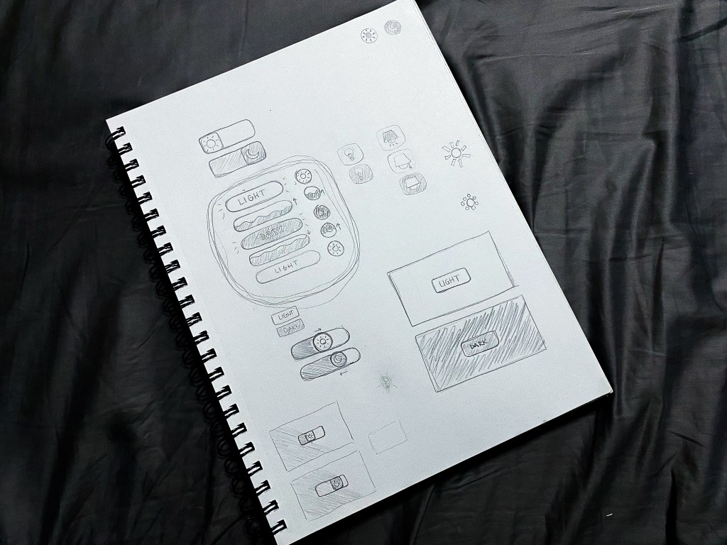
I started my process with a pencil and sketchbook, which allowed me to explore multiple button shapes, varied symbol representations for the two modes, and a few ideas surrounding the transitions between modes. After trying a few different approaches, I determined that my button would be a circle that toggles between a moon icon for dark mode and a sun icon for light. When transitioning from light to dark, the button would fill with the dark mode color in a fluid-like manner from bottom to top. When transitioning from dark to light, the button would do the opposite.
Sketching my ideas before moving to After Effects helped my animation process progress very smoothly. The only challenges I faced while developing my animation occurred toward the end when I made the decision to mask the moon and sun icons into a flat horizon as they popped up and down between button clicks. With a little research, I learned how to create masks on separate solid layers and apply alpha track mattes to each icon layer.
My favorite part of creating this button animation was incorporating audio. Finding a mouse click sound effect was straightforward. To take the animation a step further, I wanted to include two additional sound effects to indicate that the user’s request was met. Finding two contrasting notification sound effects that were both positive in nature (for free) was a bit of a challenge. Thankfully, I was able to swing it. In my final animation, I paired the lighter, higher-pitched notification sound effect with the light mode setting, and the deeper sound effect with the dark mode setting.
Altogether, I really enjoyed this project. I would love to explore alternative dark/light mode switch animations in the future. Additionally, I am open to creating UI animations in other softwares including Adobe XD and Figma.
