Reading & Writing
Chapter 9 of Animated Storytelling is called “Technique.” In this chapter, Blazer walks her audience through the final step before the animation begins. Animators often use the animation technique they are most familiar with. However, Blazer encourages the reader to step out of their comfort zone and explore all animation techniques, implementing the technique that pairs best with their storyline.
This is accomplished by considering how the final animation will be viewed, aka the format. The next and most important consideration to take involves translating your story. During this step, it’s important to review your creative brief and consider techniques that embody the overall message and tone of the story.
Once these considerations have been made, there are several techniques and visual styles to explore. Blazer progresses through the chapter by supplying the reader with descriptions of these techniques and styles. She encourages the reader to research examples of the technique/style they have chosen, seek inspiration, and adapt.
Finally, we learn to be flexible and find a good workaround to making the animation a success. Here are the workarounds Blazer shared:
Workaround 1: Import Still Images
- Making use of editing tools while working with still images inside your composition may end up feeling like full-on animation.
Workaround 2: Shoot Live-Action Footage
- Sometimes, if still images aren’t working, incorporating live-action footage into the project and processing and editing it in your program can result in a seamless animation.
Workaround 3: Staff Up
- Outsourcing work can save a lot of time and effort. It’s always a relief to have help with a big project, and the creativity of other individuals can greatly benefit the final animation.
Research
The following animated scenes utilize some of Frank Thomas and Ollie Johnston’s 12 principles of animation.
Staging
This scene from Arthur uses staging to guide the viewer’s attention. The animation incorporates direct cuts from scene to scene to identify the main subject. Furthermore, the animators also intentionally pan from one area of the shot to the next, utilizing the setting, timing, camera position, and even the acting to capture the overall idea.
Squash and Stretch
Demon Slayer’s bouncing ball scene uses squash and stretch. This principle emphasizes the speed, flexibility, and momentum of the balls as they bounce throughout the house.
Appeal
Foster’s Home for Imaginary Friends is full of appeal. Each character has a distinct appearance and character design that is interesting and intriguing to the audience. Although they are all drastically different, the common use of big, wide eyes makes each character likable.
Solid Drawing
Sony’s Hair Love makes great use of solid drawing, utilizing weight and volume to bring each object and character to life, even down to Zuri’s hair. As Zuri, her cat, and her dad move throughout the house and are seen from varied angles and perspectives, their movements make you believe they exist within a three-dimensional space.
Anticipation
Finally, anticipation is present throughout many Kim Possible fight scenes. Here, Kim and Shego consistently move into specific positions or stances in preparation to jump, strike or block their opponent.
Create
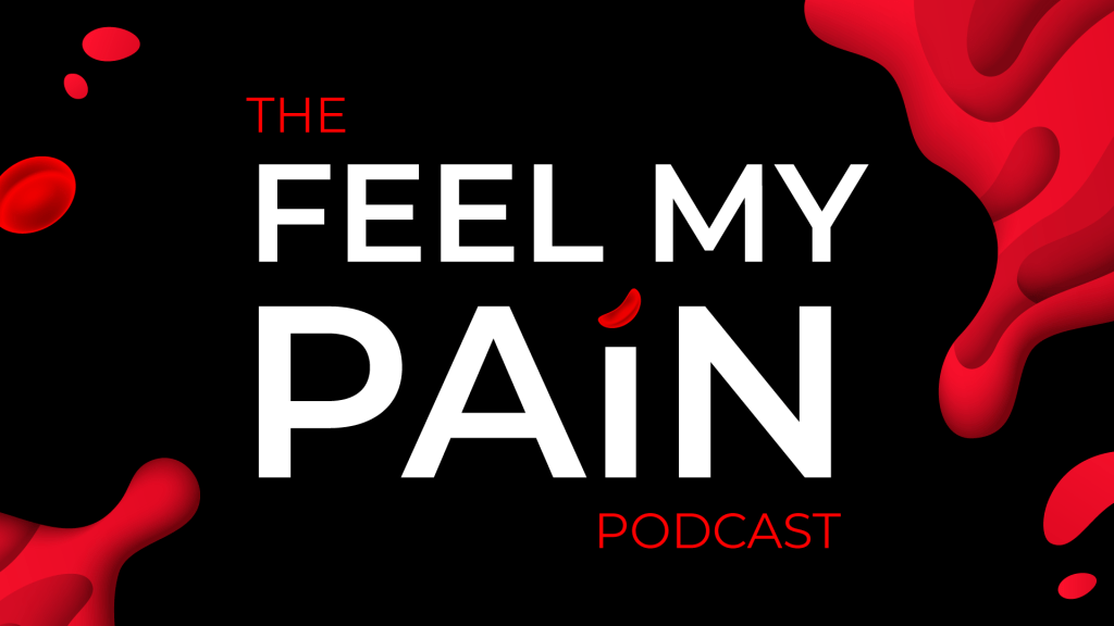
Toward the end of 2020, I woke up with a crazy idea (as I often do). My idea was to start a podcast. Long story short, I have been planning, producing, and preparing to launch the first season of my podcast, called Feel My Pain. Feel My Pain is a podcast dedicated to providing an inside look into the daily experiences of individuals diagnosed with a rare blood disorder called Sickle Cell Disease, which causes chronic pain. I have Sickle Cell, and I am also connected to numerous people directly impacted by this disease. Through the years, I have come to learn that my counterparts have completely different experiences than me. Everyone’s journey is unique.
As Feel My Pain develops, I hope to invite people with Sickle Cell and those directly connected to individuals with the disease to share their personal stories through an anonymous submission form. These submissions will be transformed into a storytelling experience in which the listener is granted the opportunity to assimilate the world of those with Sickle Cell and feel their pain. My ultimate goal for this podcast is to provide insight, increase understanding, and raise awareness for a medical condition affecting millions of people of color worldwide, including myself and my loved ones.
Sometime in July, I created the look and feel for the podcast, including sans serif type, blacks, reds, whites, splashes of blood, and a few blood cells. A couple of months later, I created an Instagram page and started working on the website. Although I am starting with a podcast, I hope to branch out and develop a blog and YouTube page, utilizing these platforms to film the podcast and provide resources and educational information for those desiring to learn more about life with Sickle Cell.
So, this week, when presented with the opportunity to animate a logo, I figured why not animate the Feel My Pain logotype for my future YouTube endeavors? Admittedly, though I am a graphic designer, I’m not a fan of logo creation; I do best with type. As of now, Feel My Pain does not have a logomark, but, being that this is a podcast, I think a logotype serves this purpose well.
I initially created the podcast graphics in Adobe Illustrator and already had a few designs on artboards sized 1920×1080. After digging up the Illustrator file, I selected the designs I needed for this project and copied them into a new HDV Illustrator template. Next, I sorted the elements into 21 different layers, naming each layer based on its contents. After finalizing my Illustrator file, I imported it into After Effects as a composition, retaining the layer sizes. Next came animation!
My main challenge was finding a way to animate the Feel My Pain text interestingly and appropriately, considering my audience and the podcast topic. I decided to direct the viewer’s attention to the word “pain,” which captivates the podcast’s theme most. Outside of the words “the” and “podcast,” every letter within the design had its own layer, so I manipulated each of them, one by one. For the animated stroke effect, I created shape layers from vector layers, added strokes to each shape layer, and followed this tutorial to apply trim paths to the letters. There was definitely a learning curve concerning creating new shape layers and getting the strokes to move how I envisioned, as it required a lot of research, trial, and error.
A second challenge arose when masking the blood in the top right and bottom left corners. I intended for the blood to emerge fluidly along the path of the blood’s shape, so I attempted to move the mask points frame by frame. However, my first few sets of masks moved very awkwardly. After a few attempts, I opted to create two large masks and gradually move them onto the screen to reveal the blood. I completed this part of the animation by sliding blood drops and a blood cell into the frame, holding the complete image for about a second, and fading everything to black.
My initial composition animated each element right after the other with everything timed according to my observations and judgment. I selected a relaxed song with the potential to open up the podcast at full volume and then decrease when the dialogue starts, fading out completely or standing as subtle background music. After adding in my music selection, I moved things around further to time it better with the song. This resulted in the words and strokes moving at a slower pace and the blood animations occurring simultaneously.
Altogether, I would like to explore more ways to animate type and blood. I think it would be nice to experiment with morphing the text or splattering the blood. I would also like to consider having a different animation and music selection for every season of the podcast.
