The final chapter in Liz Blazer’s Animated Storytelling, entitled “Show and Tell,” covers all that it takes to get your project out there. Once your film is complete, it’s time to get it out there! Here, Blazer provides her readers with details and considerations to make surrounding packaging a project, submitting to festivals (or not), networking, and sharing. My favorite tips from this chapter are the ones regarding networking.
Often, upon completing a project, we jump straight into sharing the entire project, expecting that others will see it, engage with it, and, hopefully, share it. Surprisingly, Blazer encourages her readers to first connect with peers. This includes like-minded artists, as well as people that “share a common thread with the story” of your work. Blazer’s next tip is to “Be a Good Audience.” It’s important to be supportive of other peers, as what goes around comes around. Building rapport and relationships with other individuals will likely result in genuine feedback and support when it’s your turn to share. Furthermore, Blazer stresses that self-promotion is successful in moderation and the proper settings.
Another key part of networking involves splicing up your work, sharing it in bits and pieces. Blazer suggests teasing your work out over time to pique the interest of others so that they are requesting to see it. After sharing bits of the project, share the whole thing and ask for feedback. Finally, networking in person can be highly beneficial. Get comfortable in your own skin and don’t be afraid to put yourself out there. You never know what can happen.
Blazer closes the chapter with one last encouragement, “never stop.” She describes being an artist as a “constant itch” that needs to be scratched. When the itch returns, it’s time to start the process again with a new project and a fresh idea.
Overall, as a creative person, Animated Storytelling has been informative and inspirational from start to finish. I loved Blazer’s writing style and her funny little stories and scenarios. She consistently supported her work with examples and offered great tips and advice along the way. The most important thing I learned through reading this book was to be intentional in practice with all projects. Every step of developing a project involves a tool or practice that will help refine and support the story while keeping things organized. From creating a creative brief to elevator pitches, sketching, storyboarding, selecting audio, you name it, Blazer provided me with a distinct strategy to create a solid project without it feeling overwhelming or intimidating.
Research
When working with motion and/or animation, the possibilities are endless. Here are some examples of phenomenal uses of motion, effects, and animation.
Between 2020 and the beginning of this year, my husband and I played parts one and two of a video game called The Last of Us. I always wondered how some of the scenes were created, but never took the time to look into it until now. Here’s some paralleled footage of motion-captured scenes used to create scenes from the game. The quality and editing aren’t the best, but, having played the games, I can appreciate the work that goes into creating it.
This Yoplait commercial uses animation to advertise their products creatively and expressively. The ad maintains real representations of the yogurt and gogurt moving through a playful, colorful, paper-like world. The transitions between scenes are quick, yet engaging and well-thought out.
Adobe is the most recognized creative software company, so it’s only fitting that their advertisements incorporate motion, animation, and special effects all at once. If you happen to catch their latest Premiere Pro ad on YouTube, check it out.
Create
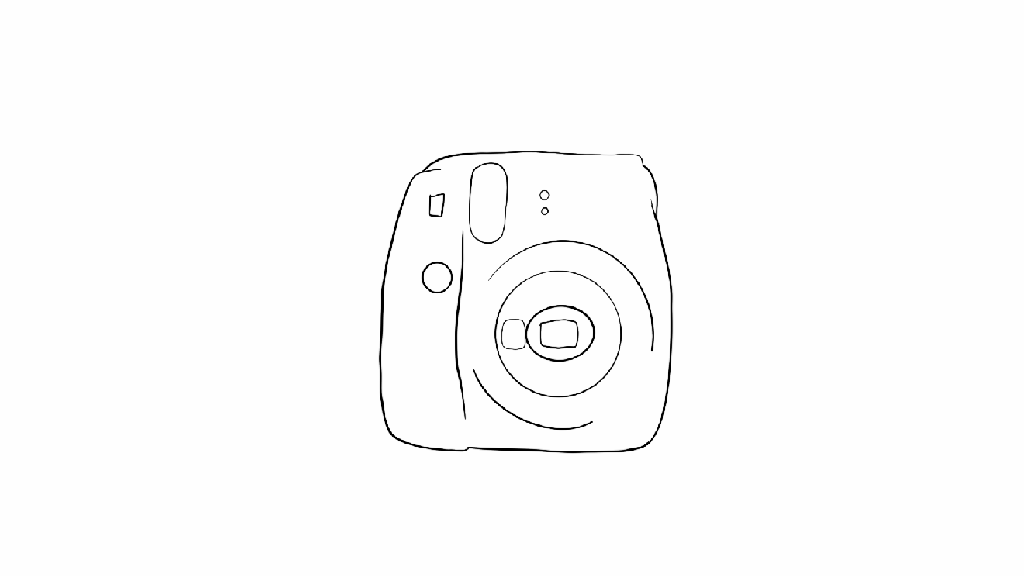
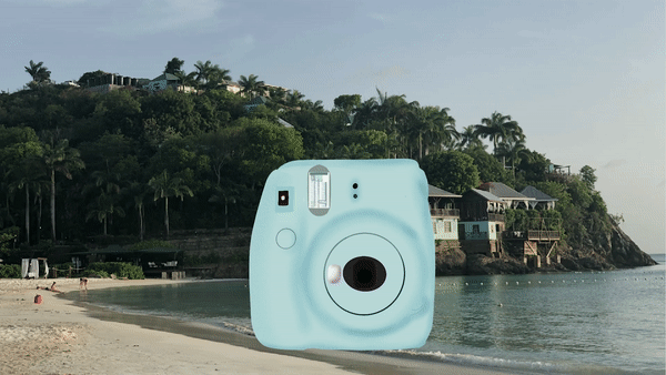
Initially, I had a few ideas floating around for my final project. I settled upon revisiting my onion-skinned animation from Module 1 and revamping it with some of the skills I have acquired throughout this course. I took the first frame of my outlined Instax camera, created in Photoshop, and utilized Procreate to add color and polish it. Next, I challenged myself to use animation assist, a Procreate feature, for the first time to animate a button push, flash, and the film coming out of the camera, frame by frame. In the succeeding frames, I scaled previous frames larger, little by little until they filled the screen, zooming into a photo containing my actual Instax camera. I made sure to line up the real Instax with the illustrated one. This allowed me to fade the real one out to reveal the illustration in the first frame, ending where we started.
Once all my frames were complete and the animation looped, I exported an mp4 and moved to Premiere Pro. Here, I added sound and reworked some of the zooming frames to make the movement smoother. Eventually, I had the bright idea to change the background to embody more of a beach/travel feel and help tie everything together, considering the oceanside soundtrack and the beach photo within the film. Unfortunately, I created my frames in Procreate using solid backgrounds within each frame. Revisiting the background within my animation meant removing the background I had already created. I opted to try it anyway and further familiarize myself with the program. This time around, I moved faster and ended up with two variations of the animation that I appreciate equally.
Working between two programs prompted me to consider all the software I’ve utilized during this course. I find that each program is unique, housing distinct strengths and weaknesses. A zooming effect may appear to be choppy using Procreate’s animation assist. However, zooming using the scale and position keyframes in Premiere Pro would result in a much smoother motion. Due to the various projects I have completed within this course, I now have a better idea of which programs may suit me best for any given project. Furthermore, my skill and knowledge levels have increased alongside my confidence in myself as a creator of motion-related media. I really enjoy animation and motion graphics and, in the future, I look forward to experimenting with more styles and mediums and potentially introducing them into my daily work as a graphic designer.
“Animate!” That’s the title of Liz Blazer’s tenth chapter in Animated Storytelling. In this chapter, we’re finally ready to get the animation show on the road. Blazer offers her readers wisdom and practical tips to ensure that the animation process will be a success.
We start off with two important steps:
Create a production calendar: Print a blank calendar and fill it in backward, starting with the delivery date and working back to pre-production. Once it’s complete, create a digital version for easy sharing.
Protect ya’ tech: Stay organized by utilizing simple file names and folders. Save versions early and often. Finally, be sure to get a hard drive and back up your files daily.
Next, Blazer provides tips for starting the project. She encourages animators to start with the scenes that are the shortest, easiest, and most fun to animate. Additionally, she suggests breaking up tough scenes into smaller chunks that are easier to tackle.
As every shot will not be included in the final animation, it is also important to become a brutal editor. This tip is especially relevant for me because I often have a tough time cutting out segments of my work that I have fallen in love with. To address this, Blazer implores the reader to question whether the shot is truly necessary. She states, “if you’re reluctant to edit the sequence because it’s your ‘coolest part,’ then definitely consider cutting it,” because it will likely take the most time and delay the production schedule. This tip was a timely reminder to avoid getting super attached to my creative work and remain flexible.
Finally, Blazer closes the chapter by providing substantial advice regarding how to remain flexible regarding movement and sound within animation.
Research
Gif created using animation video found on Career Foundry site
My first UI animation selection comes from Career Foundry. I love that all stages of the animation take place within one shape, yet the user is able to observe the progress and completion of their download. Each stage of the download has a distinct color paired with its own mini animation. The transition between each stage is quick and clean.
Aaron Iker has tons of UI animations on Dribbble. This particular animation allows the user to provide their rating, which is indicated by stars and the color yellow. Upon changing their rating, the stars that are removed return to the initial gray color, shatter, and fall off of the screen.
Here, Oleg Frolov cycles between an open and closed menu with one click. The downward arrow duplicates its stems, rotating them downwards to form an “x.” The “x,” in turn, folds those stems upwards to return to its initial state.
Screenshot of Saavan Ch’s second upload animation on Behance
Finally, moving to Behance, Saavan Ch provides four examples of how an upload can be achieved, using the same base shapes, but different animations. His second upload animation was a source of inspiration for my own creation.
Create
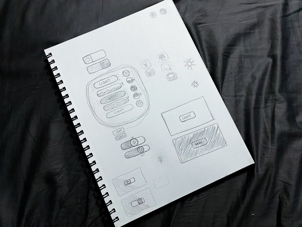
This week, I created a UI animation of my own. In the past few years, dark mode has become a popular feature amongst users of various social media platforms, websites, and even smartphones. Primarily, this feature was created to protect users’ eyes. However, today, many users prefer dark mode for its sleek look and feel. Most of my closet is black and my devices are always the same color: Apple’s “space gray,” so it only makes sense that I prefer dark mode over light. I found it fitting to create a dark and light mode button animation.
Brainstorming sketches of my dark/light mode button animation
I started my process with a pencil and sketchbook, which allowed me to explore multiple button shapes, varied symbol representations for the two modes, and a few ideas surrounding the transitions between modes. After trying a few different approaches, I determined that my button would be a circle that toggles between a moon icon for dark mode and a sun icon for light. When transitioning from light to dark, the button would fill with the dark mode color in a fluid-like manner from bottom to top. When transitioning from dark to light, the button would do the opposite.
Dark and Light Mode Button Animation, created in Adobe After Effects
Sketching my ideas before moving to After Effects helped my animation process progress very smoothly. The only challenges I faced while developing my animation occurred toward the end when I made the decision to mask the moon and sun icons into a flat horizon as they popped up and down between button clicks. With a little research, I learned how to create masks on separate solid layers and apply alpha track mattes to each icon layer.
My favorite part of creating this button animation was incorporating audio. Finding a mouse click sound effect was straightforward. To take the animation a step further, I wanted to include two additional sound effects to indicate that the user’s request was met. Finding two contrasting notification sound effects that were both positive in nature (for free) was a bit of a challenge. Thankfully, I was able to swing it. In my final animation, I paired the lighter, higher-pitched notification sound effect with the light mode setting, and the deeper sound effect with the dark mode setting.
Altogether, I really enjoyed this project. I would love to explore alternative dark/light mode switch animations in the future. Additionally, I am open to creating UI animations in other softwares including Adobe XD and Figma.
Chapter 9 of Animated Storytelling is called “Technique.” In this chapter, Blazer walks her audience through the final step before the animation begins. Animators often use the animation technique they are most familiar with. However, Blazer encourages the reader to step out of their comfort zone and explore all animation techniques, implementing the technique that pairs best with their storyline.
This is accomplished by considering how the final animation will be viewed, aka the format. The next and most important consideration to take involves translating your story. During this step, it’s important to review your creative brief and consider techniques that embody the overall message and tone of the story.
Once these considerations have been made, there are several techniques and visual styles to explore. Blazer progresses through the chapter by supplying the reader with descriptions of these techniques and styles. She encourages the reader to research examples of the technique/style they have chosen, seek inspiration, and adapt.
Finally, we learn to be flexible and find a good workaround to making the animation a success. Here are the workarounds Blazer shared:
Workaround 1: Import Still Images
Making use of editing tools while working with still images inside your composition may end up feeling like full-on animation.
Workaround 2: Shoot Live-Action Footage
Sometimes, if still images aren’t working, incorporating live-action footage into the project and processing and editing it in your program can result in a seamless animation.
Workaround 3: Staff Up
Outsourcing work can save a lot of time and effort. It’s always a relief to have help with a big project, and the creativity of other individuals can greatly benefit the final animation.
Research
The following animated scenes utilize some of Frank Thomas and Ollie Johnston’s 12 principles of animation.
Staging
This scene from Arthur uses staging to guide the viewer’s attention. The animation incorporates direct cuts from scene to scene to identify the main subject. Furthermore, the animators also intentionally pan from one area of the shot to the next, utilizing the setting, timing, camera position, and even the acting to capture the overall idea.
Squash and Stretch
Demon Slayer’s bouncing ball scene uses squash and stretch. This principle emphasizes the speed, flexibility, and momentum of the balls as they bounce throughout the house.
Appeal
Foster’s Home for Imaginary Friends is full of appeal. Each character has a distinct appearance and character design that is interesting and intriguing to the audience. Although they are all drastically different, the common use of big, wide eyes makes each character likable.
Solid Drawing
Sony’s Hair Love makes great use of solid drawing, utilizing weight and volume to bring each object and character to life, even down to Zuri’s hair. As Zuri, her cat, and her dad move throughout the house and are seen from varied angles and perspectives, their movements make you believe they exist within a three-dimensional space.
Anticipation
Finally, anticipation is present throughout many Kim Possible fight scenes. Here, Kim and Shego consistently move into specific positions or stances in preparation to jump, strike or block their opponent.
Create
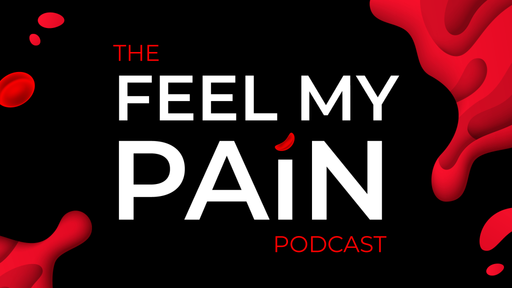
Toward the end of 2020, I woke up with a crazy idea (as I often do). My idea was to start a podcast. Long story short, I have been planning, producing, and preparing to launch the first season of my podcast, called Feel My Pain. Feel My Pain is a podcast dedicated to providing an inside look into the daily experiences of individuals diagnosed with a rare blood disorder called Sickle Cell Disease, which causes chronic pain. I have Sickle Cell, and I am also connected to numerous people directly impacted by this disease. Through the years, I have come to learn that my counterparts have completely different experiences than me. Everyone’s journey is unique.
As Feel My Pain develops, I hope to invite people with Sickle Cell and those directly connected to individuals with the disease to share their personal stories through an anonymous submission form. These submissions will be transformed into a storytelling experience in which the listener is granted the opportunity to assimilate the world of those with Sickle Cell and feel their pain. My ultimate goal for this podcast is to provide insight, increase understanding, and raise awareness for a medical condition affecting millions of people of color worldwide, including myself and my loved ones.
Sometime in July, I created the look and feel for the podcast, including sans serif type, blacks, reds, whites, splashes of blood, and a few blood cells. A couple of months later, I created an Instagram page and started working on the website. Although I am starting with a podcast, I hope to branch out and develop a blog and YouTube page, utilizing these platforms to film the podcast and provide resources and educational information for those desiring to learn more about life with Sickle Cell.
So, this week, when presented with the opportunity to animate a logo, I figured why not animate the Feel My Pain logotype for my future YouTube endeavors? Admittedly, though I am a graphic designer, I’m not a fan of logo creation; I do best with type. As of now, Feel My Pain does not have a logomark, but, being that this is a podcast, I think a logotype serves this purpose well.
I initially created the podcast graphics in Adobe Illustrator and already had a few designs on artboards sized 1920×1080. After digging up the Illustrator file, I selected the designs I needed for this project and copied them into a new HDV Illustrator template. Next, I sorted the elements into 21 different layers, naming each layer based on its contents. After finalizing my Illustrator file, I imported it into After Effects as a composition, retaining the layer sizes. Next came animation!
My main challenge was finding a way to animate the Feel My Pain text interestingly and appropriately, considering my audience and the podcast topic. I decided to direct the viewer’s attention to the word “pain,” which captivates the podcast’s theme most. Outside of the words “the” and “podcast,” every letter within the design had its own layer, so I manipulated each of them, one by one. For the animated stroke effect, I created shape layers from vector layers, added strokes to each shape layer, and followed this tutorial to apply trim paths to the letters. There was definitely a learning curve concerning creating new shape layers and getting the strokes to move how I envisioned, as it required a lot of research, trial, and error.
A second challenge arose when masking the blood in the top right and bottom left corners. I intended for the blood to emerge fluidly along the path of the blood’s shape, so I attempted to move the mask points frame by frame. However, my first few sets of masks moved very awkwardly. After a few attempts, I opted to create two large masks and gradually move them onto the screen to reveal the blood. I completed this part of the animation by sliding blood drops and a blood cell into the frame, holding the complete image for about a second, and fading everything to black.
My initial composition animated each element right after the other with everything timed according to my observations and judgment. I selected a relaxed song with the potential to open up the podcast at full volume and then decrease when the dialogue starts, fading out completely or standing as subtle background music. After adding in my music selection, I moved things around further to time it better with the song. This resulted in the words and strokes moving at a slower pace and the blood animations occurring simultaneously.
Altogether, I would like to explore more ways to animate type and blood. I think it would be nice to experiment with morphing the text or splattering the blood. I would also like to consider having a different animation and music selection for every season of the podcast.
A progression of test shots, taken in preparation for production.
Reading & Writing
This week’s reading of Animated Storytelling covered Sound Ideas (chapter 7) and Design Wonderland (chapter 8). Here are some key takeaways from each chapter:
Sound Ideas: Get your audio and story in sync
Let Sound Lead the Story: it is important to consider sound before animation. Sound shouldn’t be an afterthought. It should be part of your writing and design. Furthermore, sound should serve as the “primary compass for your storytelling.”
Diegetic (literal sound) comes from sound sources that are visible. This sound comes from the physical world within the film.
No-diegetic (non-literal sound) includes sound sources that are not visible and unnatural to objects in the scene.
Sound effects are accomplished best when limited. “Restraint is key.” Overuse of sound effects can result in ineffective sound effects.
Channel your poet. Surreal sound effects may capture your message or expression more effectively than literal sound effects.
Music can serve as sound effects, providing an “organic feel, while also giving your entire soundtrack the feeling of synthesis.”
Music can determine emotion, set the rhythm, and guide the journey within your story.
Score to “theme”
Consider the music of “silence”
Score “against”
Only include dialogue if it is absolutely necessary.
Match every line of dialogue to the character’s personality.
Characters need to speak in a real, relatable, naturalistic way.
Have your characters speak in a way that matches the overall mood of the scene.
Narration/Voiceover for Motion Graphics
Clarity and brevity are key when scripting for motion graphics. Leave no room for misinterpretation.
“Write brief, and write clear, but also write visual.”
Perform and edit your draft multiple times to refine it.
Once the script is recorded, determine where the music comes in.
“The pace of the voice drives things, type sits at the center, and design is the spoonful of sugar that helps the medicine go down.”
Ready, Set, Go: move onto design and animation
A Final Word on Timing: “Timing is everything.” Carefully consider the placement of every cue, dialogue, sound effect, etc.
Design Wonderland: World building and environmental design
“Animation allows you to create any chaos you want.” Once your world is introduced, you must commit to it. If you do not commit to the world you have created, you’ll lose your audience.
Continuity is key. If you go against your world’s logic, you’ll face continuity issues.
But First (Again): Be Influenced
Have influences that inspire you. “Borrow ideas and inspiration from the stories that you love most.”
Designing the Rules
Establish your world’s time and place. Past, present, or future?
Define the physical order
Define the social order
Define the visual order
Look around! Our world is inspiring.
On Motion Graphics & Branding
Study the core values of the brand and establish visual rules around it.
Research
Effective Audio
Pixar’s Wind is an animated short that tells the story of a grandmother and her grandson who are trapped together in a barren land. Although there are no audible words spoken between the two, the animation’s music, ambient audio, and sound effects all work together to effectively capture and support the events taking place within the short. This clip starts with music and progresses with sound effects, followed by subtle ambient audio outside of the house and, finally, more effects that are loud and impactful.
Spiderman: Into the Spider-Verse, created by Sony, is one of my favorite animated films. Throughout the movie, you can hear conversations between the characters, overlapping ambient audio between the city, Miles’ school, and other settings, sound effects that align with the action-packed fight scenes, and so much more. This particular scene transitions back and forth between dialogue, sound effects specific to each character, the audio of the cafeteria, and the thrilling music seamlessly. There’s even quick text animations thrown into the mix while Miles and Peter swing from the trees.
Effective Text Animation
Speaking of text animation, the opening logos for Into the Spider-Verse, are animated repetitively to mimic a glitching effect seen throughout the movie. From the start of the movie, this is an effective way to hint at a common theme within the storyline.
Animated lyric videos have become popular throughout the years. Often times they consist of looping footage and words thrown on the screen. Every once in a while, however, artists use this opportunity to animate the text, which makes the lyric video an enjoyable experience for their audience.
Finally, you may not have noticed, but Apple uses text animation in a lot of their videos. Sometimes it is subtle and uniform, and, at other times, it is colorful and dynamic. Across all of their videos, you’ll find that the footage and the text do not compete with each other. Within each video, all elements coexist peacefully.
This week, I utilized stop motion to bring my linear story idea from my last blog post to life. Initially, I wanted to focus on my nonlinear storyline which involved filling a barren greenhouse with plants shelf by shelf. I felt that my nonlinear storyline would be active, colorful, interesting, and enjoyable to create. However, upon reviewing my two storylines, I decided to challenge myself to incorporate more color and activity into my linear storyline. I experimented with and built upon my storyline, in these ways:
Numerous household objects scuttling across the ground (tabletop) and toward the mugs with varied speeds and motion patterns
Clouds cycling through the sky (wall)
Sound elements including a soundtrack and multiple sound effects to drive the action within the animation
These amendments surely brightened up my piece, however, they presented additional challenges. For example, many objects within a stop motion means many focal points for the camera. It also means there will be many items to account for and manipulate. Additionally, the clouds were a last-minute improvisation, created using polyfill stuffing from a hole in my dog’s pillow, and blue painter’s tape. Over time, while shooting the stop motion and relocating the clouds between each shot, the painter’s tape did not stick to the wall well and became more exposed.
Although I truly enjoyed creating this stop motion, I did encounter a few more complications along the way. For one, I attempted to capture a second shot to incorporate into the final animation, but unfortunately, using a scissor arm phone holder, coupled with my iPhone resulted in unstable shots and choppy footage, because I used my iPhone’s volume control buttons to capture the shots and the phone holder covered the majority of the screen, so I couldn’t quite see what I was capturing. My phone also died unexpectedly, leaving me with incomplete footage.
Better Together iPhone Outtakes
For my main shots, I used my Sony a400 and a Meike battery grip and remote. Although I have had the grip and remote for a while, this was my first time making use of the remote. I quickly realized that it isn’t really intuitive. After watching various Youtube videos and practicing with the remote, I still struggled with shots because the remote would refocus the lens with every shot. My camera would also sleep and the lens would retract as I was moving objects around between shots. Therefore, my stop motion contains 2-3 shots that are out of focus and the lighting is slightly different between shots. This intercepted some masking I intended to do in post production. I wanted the clouds to stay in place from the start of the breaking scene to the completion of the mug’s mending. Instead, I inserted two frame holds to highlight those moments.
Finally, my greatest challenge in post was sourcing sound effects. Finding the right sounds to pair with the movement of the mugs, or the items shuffling across the table, or the impact of the hammer hitting the mug required a lot of time and patience. In some cases, there were too many options to choose from. In others, there were too few, so I created my own. Despite all of this, including sound effects was not necessary, but it made the stop motion more realistic and engaging.
One of my favorite parts of post prouction was the music. I included a sountrack, entitled “Once Again,” from Bensound to drive my stop motion. This particular soundtrack builds upon itself, adding in layers of musical instruments with each go-round. With only 30 seconds to work with, I used this building and repetition to my advantage and moved parts of the song around to match the soundtrack’s escalation with my storyline.
Altogether, learning about stop motion and then creating my own was fun and fulfilling. From pre-production to production to post, each stage helped me practice intentionality and consider all aspects of my work. With time, I hope to grow my stop motion experience and perfect this animation style. I look forward to creating a stop motion animation for my nonlinear storyline very soon!
So far, while reading Liz Blazer’s Animated Storytelling, I have learned the various steps and practices that make up Pre-Production, Storytelling, Unlocking Your Story, and Storyboarding. This week’s chapter readings covered Color Sense and Weird Science.
Color Sense
Enhance your story with the right palette
In chapter 5, Blazer shares that color is a significant and powerful component of animation, housing the capability to “express emotion, clarify motivation, and enhance the entire meaning of your piece.” She opens the chapter by clarifying a few color-related vocabulary words that we are all familiar with but may use interchangeably. Here are Blazer’s definitions:
Hue: the common color name in the spectrum, like red, blue, or orange.
Saturation: the intensity or purity of a color.
Value: the relative lightness or darkness of a color. How much light the color is exposed to determines its value. High value color is closer to white, while low value is closer to black.
Tone: reflects the overall brightness or darkness of an entire shot or scene, regardless of the colors used.
Blazer continues by guiding the reader through creating a color script and a pre-color script.
Color script: a sequential visual outline of how you intend to use color in your animated film.
Pre-color script: your storyboard represented by a series of rectangular color bars that match your most essential story beats.
Once the hue, saturation, and value throughout the storyline have been identified, the rest of the color palette can be determined. While determining the color palette, it is imperative to never let the color of the surrounding scenery outshine the characters. After finalizing the pre-color script, the selected colors can be integrated into the entire storyboard. Finally, colors are selected for supporting characters, backgrounds, and props within every shot.
In the final section of this chapter, Blazer shares some of her most important tips regarding utilizing color within animation:
Design for Movement
Limit Your Palette
Use Saturation Mindfully
Support (Don’t Upstage) Your Subject
Use Surprise Color for Punctuation
Select One Thematic and One Accent Color
Make Your Own Rules
Weird Science
Experiment with animation
To start off this chapter, Blazer reminds us that, by nature, animation is one of the most experimental film mediums. She explains that “experimentation is an essential step in getting the most out of the animated process and may even help you to discover the defining moment in your story. Sometimes stories are even born from the process of animation itself.” Blazer encourages her audience to find their own weird science by creating “bad” art and working on the edge of their skill set.
Next, Blazer shares two scenarios in which experimentation can be beneficial in the long run.
Making the Work You Want to Be Hired to Do: To avoid being pigeonholed within the industry, animators can experiment with creating work that interests them. Displaying this work alongside the work they are recognized for could open the door to new work opportunities involving the animation style they desire to be hired to create.
Working on Personal Projects Pays Off in Unexpected Ways: Challenging yourself to experiment in your craft can get you further than you think. Not only will you learn new techniques and grow in your skillset, but your personal work may also be recognized and appreciated by others too!
In the last section of this chapter, Blazer encourages her audience to create an experimentation list by supplying her audience with different areas to experiment with within each storyboard scene. Some of these areas include technique, design, movement transitions, sources, and sound. She concludes the chapter by highlighting two areas of experimentation that animators must explore: transitions and movement.
Research to Inform
This week, I gained more exposure to stop motion. Stop motion is an animation filmmaking technique involving photographed frames. Within each frame, objects are manipulated in small increments. The frames are pieced together in video format to create the illusion that the objects are exhibiting independent motion.
Since the 1840s, stop motion has been used to create groundbreaking films and animations. To this day, stop motion is seen in music videos, advertisements, movies, independent animations, and more.
Music Videos
Music videos contain some of the most engaging stop motion work I have come across. A number of the songs I have grown to love throughout the years incorporate stop motion to convey a story in an impactful way.
Lettuce With a Perm
This stop motion creator utilizes audio to bring their work to life. Although the animation is distinct and intriguing when watched without audio, the audio serves as a huge cherry on top, captivating the viewer all the more.
Coco Peri is a multi-disciplinary creator, widely recognized for her stop-motion animations. She creates vibrant and colorful ads for various brands we all know and love. You can find some of her work on her website or in her reel below.
Short Films
Stop motion films astound me. I can’t imagine the amount of time and patience required to create a stop motion film, especially the ones that contain hand-crafted and manipulated materials. Although they may be a pain to create, these films are impressive works of art, containing multiples scenes and highly detailed elements.
Expedia Commercials
Finally, Expedia’s recent trip commercials combine playful music and whimsical movement across a large set that continuously catches my eye during commercial breaks. These stop motion ads make everything look fun and simple. However, working with multiple scenes and animate and inanimate objects all at once is no small feat.
Create
In preparation for creating my own stop-motion animation, this week I worked through pre-production for two stop-motion storylines. Each pre-production summary includes a general idea, creative brief, and storyboard.
Non-Linear Storyline: The Greenhouse Cabinet
My first storyline involves a barren greenhouse cabinet. The goal is to use The Beaded Necklace storyline format to animate the process of the greenhouse cabinet becoming the home of various plants to the beat/tune of an uplifting soundtrack.
Although this storyline is my top choice, my cabinet contains a lot of plants which means there will be tons of moving elements within this stop motion. This may present a challenge, as well as keeping the soundtrack in mind while shooting and timing the stop motion to the music.
To view the details of this storyline including my inspiration, creative brief, and storyboard, check out the pdf below.
This storyline contains a beginning middle and end:
Beginning / Exposition: Two mugs (friends) journey side by side across the dining table
Middle / Complication: The black mug collides with a spoon and cracks into pieces
End / Resolution: The white mug moves the spoon away and circles around the black mug to mend it. Once the black mug is restored, the two mugs continue their journey across the dining table.
“Mug Buddies,” as I’ve dubbed it for now, will tell a story of help and companionship. The goal is to illustrate the value of friendship, even amongst contrasting individuals, in a unique and creative way.
Should I chose to pursue this storyline, I am excited to experiment with the breaking and mending of the black mug. I have two identical black mugs that I glazed at a pottery shop. One is broken and one is not. My main concern with this storyline is creating a mending scene that is seamless. The broken mug may require some sort of adhesive to hold some pieces in place.
Recently, my husband and I have started playing Uno together during our downtime. To get my feet wet, we worked together to shoot a quick stop motion using the Uno cards spread out across our old coffee table. Using a scissor arm phone holder to assist with sustaining our shots, I moved the cards while my husband snapped the photos.
It’s not my best work, (as my tripod has recently been occupied while I shoot a timelapse of a new leaf unfurling on a plant) but this was a great opportunity to experiment with a new form of animation and manipulate various objects within one scene. Additionally, this was my first time utilizing premiere pro to convert images into a sequence.
Moving forward, I am excited to be intentional about the staging and framing of the objects within my final stop motion. No matter which storyline I decide to bring to life, I hope to cover all aspects, areas, and details within the piece, including the objects, movements, lighting, sounds, angles, etc.
Chapter 2 of Animated Storytelling begins with Liz Blazer’s emphasis that, in the world of animation, the possibilities are endless. She shares, “there are no limitations.” Blazer introduces two approaches to storytelling she later discusses: the standard storytelling model and non-narrative storytelling. She goes on to informs us that, after a narrative idea is established, the next step is to plot it out and find the beats,” also known as the active steps that move the story along. She offers tips on how to find the beats and solidify them. Once the beats are narrowed down and concrete, you can move on to choosing a suitable storytelling model. Using a plethora of examples and references, Blazer goes into detail by breaking down the two storytelling models as follows:
Three-Act Structure: Problems Solved
“a linear story with three basic steps or acts”
Creat the beats.
Build the story’s arc.
Act 1: Problem
Act 2: Attempt to solve it
Act 3: Resolution
Nonlinear Structure
“A story should have a beginning, middle and end, but not necessarily in that order.” Jean-Luc Godard
Build around an inspiration.
Build a structure.
Use a known structure.
Book Ending
The Beaded Necklace
The Countdown
The Puzzle
High Concept
Unlocking Your Story
Chapter 3 is a prerequisite for storyboarding, which comes in the following chapter. Here, Blazer makes it clear that the basic elements of your story need to be finalized in order to progress with the next chapter. She then provides four unique narrative exercises to help make the reader’s storyline more clear. These exercises include:
Clear Conflict, Reveal it Early
Start Later
Biggest Secret
Get Graph-y
Not everyone’s story will be narrative, therefore, the second half of the chapter introduces the reader to the experimental form. Blazer asks the following questions to help the reader determine if they would rather explore the experimental approach.
When you think about the story you want to tell, do the images in your head veer toward dream-like, abstract, or surreal?
Does your need to experiment with forms and materials seem to be ruling your storytelling process?
Do you find the prospect of exploring new territory in terms of story structure especially exciting when it comes to your story?
If any of these questions are answered with, “yes,” the reader has permission to explore the following experimental exercises:
Visual Music
Pure Poetry
Repetition/Evolution
Continuity/Diversity
Anthology
Cut it Out & Play!
Storyboarding
Chapter 4 covers storyboarding, starting out by introducing the reader to Walt Disney. Blazer explains that one of Disney’s most successful innovations occurred “when he decided to pin up a series of his rough sketches in sequence to help explain a story idea to his team.” Since then, storyboarding has become a cost-effective way to flesh out the details of a story before animating.
Blazer continues by dissecting various approaches to working out visual elements within a piece such as thumbnailing and storyboarding. She goes on to discuss storyboarding hints, offering tips and suggestions that will help iron out details and help the reader craft strong depictions within their storyline. Blazer covers shot composition, framing, and staging. Next, she addresses continuity, including spatial continuity, temporal continuity, and directional continuity. Finally, Blazer discusses the importance of timing and animatics.
These three chapters were highly informative, detailing the ins and outs of creating and solidifying a storyline. Blazer provided names and backstories for a number of animations to reference. She also included various storyboards to display what makes a storyboard a success. Blazer committed time to ensure that her readers have a step-by-step guide to keep them from getting lost on the road to animating. As a visual person, her tips and supporting examples benefit me greatly. Additionally, as a person who consistently questions their work, Blazer dissects everything in such a way that makes taking on a large creative project feel achieveable.
Research to Inform
You have probably seen a cinemagraph in action and passed it up as a GIF. Although they are closely related, GIFs and cinemagraphs have distinct characteristics. So what exactly is a cinemagraph?
A cinemagraph is an animation majorly comprised of a still photograph. At first glance, cinemagraphs may appear to be completely static. At a second glance, you’ll notice that cinemagraphs contain subtle motion that is often repetitive. A portion of the image in the foreground, background, or in one specific area is isolated from the rest of the photograph, containing ever so slight motion. This motion plays in a short, creating a loop.
Cinemagraphs exist where photography and videography merge. Well-crafted cinemagraphs are often identified as seamless, blending the active video into the still image and looping the video so that where it starts and ends go unnoticed.
Common cinemagraphs you may come across may study motion within the context of food and/or beverages.
Others may manipulate the land, the sea, the skies, and the elements.
Some may explore lighting or lights.
While others may contain motion that is very discrete.
Some cinemagraphs feature physical movement.
Other motion may exist in the background, foreground, or off to the side.
And surprisingly, cinemagraphs can be illustrative and mixed media too!
Create
Although I have stumbled across a number of cinemagraphs in my day, I never realized that they were a recognized form of animation. I’ve seen others utilize apps to make clouds move through the sky or waters ripple in their images, but I have never tried it myself.
This week I was able to do just that. While learning how to create my own cinemagraphs, I decided to explore some of the subtle movements that often take place within and around my household. To capture these shots, I utilized my iPhone, set to 4K, a tripod, and a ring light. The first two pieces were created in Photoshop. For the remaining cinemagraphs, I used After Effects.
The candle, created in Photoshop
My first cinemagraph featured a candle placed next to a bouquet. I wanted to explore the movement of a lit candle in contrast to a static bouquet. I experimented with different types of movement, including the lit candle wicks encompassed by dancing fire, sliding the lighter into the frame to the left of the candle, and smoke rising from the candle after blowing it out. After testing out all types of movement within my masked still, I found that the most continuous and nearly seamless motion occurred within my first movement type, the lit candle. The other motion options gave me the impression that I was creating a GIF.
Relax, created in Photoshop
This piece was fun to create and resulted in an almost seamless cinemagraph. To create movement while shooting, I started up the diffuser on the right and continuously tapped on the leaf to the left. I love the bobbing motion of the leaf. However, I found that a heavier bounce produced a more evident transition. I attempted to cut out the footage with distinct bouncing motions and maintain the slight bobs, but there’s still a little bounce in there. Additionally, this cinemagraph taught me to be more intentional with my lighting. Although I utilized a ring light to brighten up the space, it may have been too bright, resulting in shadows surrounding the elements in the shot. It feels as though you can see the line between the still and the video, but these shadows actually exist in the raw footage. Finally, I would have loved for the diffuser’s mist to be more prominent and noticeable. A closer shot may have made this possible.
Guttation, created in After Effects
I call this cinemagraph “Guttation.” Guttation is a process in which water droplets (xylem sap, to be exact) secrete from a plant’s pores. The goal of this cinemagraph was to capture a droplet falling from the plant’s little leaf. Unfortunately, since it’s sap and not pure water, the sap would not budge, no matter how hard I tapped or shook the table. To get it to fall, I pushed the leaf, a little too hard, which resulted in me dedicating time to masking my fingers out of the cinemagraph. After Effects was useful for creating this piece because I could manipulate the mask frame by frame, using keyframes. Although the droplet eventually fell, creating a looping effect was a challenge. I ended up with a reversing effect. The movement within this cinemagraph is comprised of my constant table-bumping.
Next, I experimented with masking the top half of the window and capturing the motion of the clouds and trees. This didn’t quite work out how I wanted it to either. Furthermore, my multiple exports of the second approach resulted in a static cinemagraph, possibly because I utilized the time stretch feature in After Effects a lot to make the clouds move faster. Although this cinemagraph is not my favorite, I learned about the pros and cons that exist between. Photoshop and After Effects. I also understand the importance of being intentional regarding looping when creating cinemagraphs. Next time, I’ll go for a tighter shot of just a portion of the window.
My final cinemagraph was somewhat of a fail. I started out with the intention of catching the movement of light in my living room caused by the trees waving in front of the sun. Once I started filming, the leaves were not moving as much. Then, a neighbor walked through the frame while walking her dogs. I figured I could use that movement instead, but, I found that looping this kind of movement would be very difficult without my piece resembling a GIF.
Liz Blazer starts off Animated Storytellingby highlighting the relevance of animated storytelling in our society. Today, storytelling is meaningful, significant, and powerful for a plethora of individuals, audiences, and platforms. Successful animated storytellers are in high demand, yet few and far between. Blazer emphasizes that, no matter what form or method of animated storytelling you utilize, it is imperative to be mindful of the story you are telling. She states, “being intentional about storytelling is the key to success.” Blazer shares ten steps throughout her book to be a successful animated storyteller, starting with the first chapter: Pre-Production.
Pre-Production
Chapter 1 of Animated Storytelling discusses the significance of pre-production. Before jumping right into animation, it is important to plan and prepare for the animation you want to create. This is achieved through Concept development, previsualization, and asset building. If the animated work is a building, these three stages of pre-production are the foundational blocks needed to start constructing. Furthermore, once these stages are complete, you’re off to a great start at developing a solid animation.
This chapter reminded me that every creative piece requires intentionality, even from the start. Without a vision, research, and a plan, you are likely to get lost in your work. Blazer writes, “jumping right into animation before completing the stages of pre-production is kind of like climbing into the ring with a prizefighter without having had a single boxing lesson. You might get a lucky jab in here or there, but after that it’s going to be a bloodbath.” If you’re not intentional about establishing a concept, determining the look and feel, and gathering the assets needed to start producing, your journey into production will get messy.
Although Blazer walks the reader through each stage step-by-step, here’s her quick guide on how to get started with pre-production:
Write a creative brief.
Identify your big idea and create a storyline.
Be open, follow the Yes, and… rule.
Clarify tone and story o objectives by writing an elevator pitch, six-word story, and tag line.
Determine your project’s look and feel with influences and by experimenting with design direction.
Make changes to your story based on design decisions.
Begin building and organizing your assets.
Rough out a style frame.
Research to Inform
GIF-Sharing Today
These days, animated GIFs are popular, effective, and timeless because of how relatable they can be. GIF-sharing is a quick way for people to express their thoughts and feelings without using words at all. There’s a GIF out there for any and everyone.
Furthermore, GIFs can capture complicated thoughts and concepts and transform them, making them simple and palatable. Generally, GIFs are received well and are easy to understand.
Here’s a look at some of my favorite GIFs:
Homer
Even if you haven’t watched The Simpsons, you will surely be able to relate to GIFs that originate from this show. Jokes from The Simpsons are classic and have stood the test of time.
Although my favorite Homer GIF shows him vanishing into a hedge, this GIF of him falling down the stairs is not only hilarious but clever. It goes beyond traditional looping identified amongst animated GIFs. It’s seamless, meaning you can not tell where it ends or begins, so Homer keeps falling down a never-ending staircase. It’s simple, yet brilliant.
Homer Falling
Homer Vanishing into the Bushes
Sometimes people make amendments to existing GIF animations to make things even more relevant. Recently, Homer’s vanishing GIF was used to make a funny meme in which he is holding a houseplant. In the plant community, this houseplant is often labeled as “rare” and “expensive.” There are long-running jokes about plant-lovers sneaking their latest plant purchases into their house in hopes of hiding it from a roommate or loved one. The caption on this modified GIF was “trying to sneak another monstera into my flat without my roommates noticing.” Added layers and nuances within GIFs make them even more fun.
Homer Hiding Monstera Albo. GIF found on Instagram
Real Life
I call the following GIFs “Real Life GIFs,” because they display the realities we all face at one point or another regarding our circumstances and emotions. We have all said “I’m fine” at some point in life when we were likely anything else but “fine.” Therefore, We can laugh at relatable GIFs, knowing that we are not alone in what we experience.
Storytelling
Finally, GIFs that display a story are effective because they easily explain a process or journey within seconds. Whether making coffee, growing a plant, baking cookies, or slicing fruit, these GIFs allow you to observe how something is accomplished without it being over-produced or over-explained.
Create: GIFs of Three Things I Love
Plants
In the past year, I have become a plant enthusiast. I started taking photos to document the progress of each of my plants and eventually created an Instagram page to further document my journey, learn more plant-related things, and connect with other plant-lovers. Created using three video layers in Photoshop, the GIF below pictures a cut-out leaf from my current favorite plant moving back and forth as the background alternates between three textured images.
Textured Monstera GIF. Background images from pexels
Creating each layer within this GIF required me to remove the Monstera leaf from its background, rotate and place it where desired on the canvas, and add in a textured background overlaid with a gray-colored layer set to multiply. The three layers were then merged to create one layer. I repeated this process two more times and converted all layers to video layers to develop the final product.
Original monstera photo
Capturing Memories
Onio-skinned GIF of my polaroid camera in action
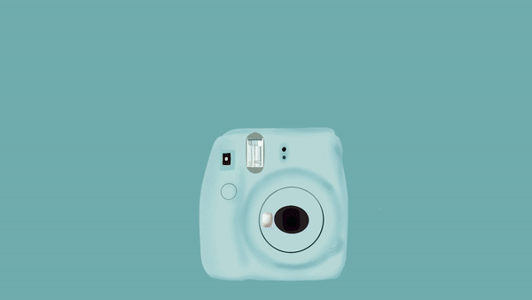
I love capturing memorable life moments via photos, videos, and, oftentimes, polaroids. This GIF is an onion skin animation of my Instax Mini camera, snapping a photo. After the camera flashes, the film emerges from the top of the camera and floats through the frame. This GIF was created in Photoshop using a video layer. Although the camera was stagnant, the flash and the film were active. The file GIF was created using 33 separate drawings.
My Instax mini camera
My Husband
This final GIF alternates through several images I recently captured featuring my husband. To celebrate hitting 500k followers on TikTok we staged an in-home photoshoot for use on his social media platforms. These close-ups are some of my favorite shots from the mini shoot.
This GIF was also created in Photoshop. However, this time I created a frame animation instead of creating a video timeline. Using eight frames, I alternated between each photo at five frames per second and set the GIF to loop.
My husband in action
One of the photos used for the 500k post
Final Thoughts
GIFs are fun, interactive, informative, and relatable. Whether created using existing footage, photos, illustrations, or more, GIFs are useful in many ways. They are fairly simple to create and functional for any experience level. Whether making them or sharing them, GIFs are engaging and enjoyable for all audiences.
This semester, in my Ideation, Prototyping, and Testing course at Quinnipiac University, I have been creating a companion app to accompany the city of Baltimore website. From assessing the Information Architecture (IA) of the city’s site to creating an IA map for a companion app to naming the app Baltimorean and mapping our user flow diagrams, I got to explore what it takes to truly Ideate, Prototype, and Test a product.
Prototyping can be accomplished in various ways, including paper prototyping. Photo by Amelie Mourichon on Unsplash
In UX Design it is imperative to ensure that a product works before releasing it to the public. Prototyping creates the space to “determine whether or not the design (or changes) work the way you intended them to—before they’re out in the world and in the hands of your users.”
A prototype is a scaled-down version of a product, used to sample or simulate ideas and designs. Prototypes provide a quick way to investigate your ideas before investing a great deal of time and money into developing a product. Prototypes come in all kinds of shapes, sizes, and versions, “ranging from simple paper models to fully functional, interactive digital prototypes.”
High-Fidelity Prototypes
InVision is one of many tools utilized to create high-fidelity prototypes. Photo by Daniel Korpai on Unsplash
CareerFoundry describes high-fidelity prototypes as, “the more detailed, realistic prototypes that look and operate much like the final product.” High-fidelity prototypes are often created once User Experience professionals have a solid idea and understanding of the product they are building. They are often refined versions of paper prototypes and/or low-fidelity prototypes. High-fidelity prototypes are more realistic, typically containing hierarchy, clickable links, and buttons, functional menus, and content that may appear in the final design.
Some prototyping tools utilized to create high-fidelity prototypes include Marvel, Axure, Balsamiq, Sketch, InVision, and Adobe XD. For Baltimorean, I chose to use Adobe XD.
Prototyping Baltimorean
My XD Experience
Adobe XD Artboards of each of my Baltimorean app screens utilized in my prototype.
Generally, I use Adobe’s Creative Cloud software to accomplish my daily tasks as a graphic designer, both professionally and personally. In the past few months, I have become more familiar with Adobe XD. Though I have mostly worked on prototyping websites, this project presented the perfect opportunity to grow my skills and experience in the program. I utilized Adobe XD to create my Baltimorean high-fidelity prototype.
While referencing my work from week 5, I created each screen using XD’s design feature. I linked the pages together and added interaction into the app using XD’s prototyping feature. As I progressed, to test the functionality of my app and gauge my choices regarding the interface, I previewed using XD’s desktop preview feature as well as the XD app on my phone. Once my screens were complete, I used XD to screen record a user journey through the app, exploring all the pages I created and features I added.
Rotato
Rotato is a free app that allows users to create high-quality device mockups of their prototypes.
Although XD provides great previews via the desktop and an external device, this program does not have a feature for viewing the prototype within a device mockup. I used Rotato to complete my prototype.
Rotato is a virtual mockup software that allows users to bring their designs to life. You can upload photos, videos, and audio to your device mockup, customize your device, and add in a few animations to make your product fun and engaging. I uploaded my XD screen recording to Rotato to give my app a realistic feel and complete my prototype.
Screen Captures
Here are screen captures from my prototype, created in Adobe XD and mocked up in Photoshop. You can also view the XD screens here.
App Revisions
In my prototype, I reworked the icons within the bottom and top navigation. Additionally, I revised some of the buttons within event and article listings for clarity.
While designing my prototype, I considered my findings from usability testing highly. I made sure to pair text with the bottom navigation icons to mitigate confusion. Furthermore, some of the elements that were previously icons became buttons or links with written-out text. In the top navigation, I chose to represent the language selector with an abbreviation instead of an icon. I also incorporated a back button within the app so users can return to previous app screens without having to start their journey over.
To simplify the app, I removed the “more” page entirely. Similarly, I expounded upon some text and limited some text within the app for clarity’s sake.
Overall, I chose to maintain a simplistic approach to Baltimorean’s design.
Not too many photos, but just enough. not too many colors, but just enough. Not too many typefaces, features, transitions, etc., but just enough for the user to be able to accomplish their goal in a convenient and timely manner. Design-wise, I followed one of Baltimore’s brand guides, found online, to keep myself structured.
Final Thoughts
Using Adobe XD to test the Baltimorean prototype on my iPhone.
The process of crafting a companion app to accompany a complicated, confusing, and slightly disorganized city or town website is no small feat, especially when a companion app has never been created for that city. User experience design seeks to unearth user’s needs and find viable solutions for those needs.
This Ideation, Prototyping, and Testing course taught me how to do just that: Ideate, Prototype, and Test. Through this project, I was able to gain first-hand experience on iterate aspects and stages of Design Thinking. Although I did not foresee how beneficial a companion app would be for Baltimore City’s website, I now understand that this app would be a great tool for Baltimore’s residents. Instead of spending time searching the city’s website endlessly, an app like Baltimorean would allow users to find what they are seeking swiftly, especially when on the go.
Altogether, I loved the process of building Baltimorean from the ground up. I enjoyed exploring and experimenting with various steps, techniques, strategies, and practices all with one goal in mind: meeting the user’s needs. I have great respect for UX professionals tasked with making complicated products, services, and features more simple, accessible, and enjoyable.
Last week, I stated, “In User Experience (UX) Design, creating a simplified version of a product before its full development is called Prototyping.” Prototype is the fourth stage in the UX Design Thinking Process. This week, I tested my prototype with two users. Although Design Thinking is an iterative process, the final stage of the 5 stage-model is called Test.
Test is the fifth stage with the UX Design Thinking process.
Stage 5: Test
Testing is a crucial component of product development that involves real users. Users interact with a prototype and provide honest feedback. This stage helps UX designers determine whether their product or solution is valid and works effectively or if it needs reworking. Amid a testing session, alterations and refinements may occur as designers observe how users experience and interact with their prototype. Furthermore, the test results may lead back to prior Design Thinking stages, or even as far back as identifying additional needs users may have and redefining the problem.
User Testing vs. Usability Testing
There are many different methods of testing including concept testing, usability testing, tree testing, etc. Photo from CareerFoundry
User testing and usability testing take place in the testing stage of Design Thinking. The two sound similar, have similar end goals, and are UX terms often used interchangeably (even by me). However, CareerFoundry makes it clear that they are distinctly different.
Here are the similarities between the two:
Both tests seek to design a product or solution that meets user needs
Both tests take note of user interactions, experiences, and challenges while utilizing the product or solution
Both look for ways to combat and address the identified challenges
Here are the differences:
User testing focus on the user. A product or solution is presented to a user to determine whether the user would actually want, need, or make use of the product. User testing asks the user if this product would be of any benefit to them.
Usability testing focuses on the product. It “looks at users’ needs in the context of an existing product.” The goal is to observe a user’s interactions with the product to see if the product works for them. There are often tasks for the user to complete which help UX professionals identify how users might journey through the prototype to accomplish their tasks.
Usability Testing in Practice
A photo of my updated prototype using POP. This screen serves as a confirmation dialog box after submitting a service request using the app.
This week, I performed two usability test sessions using a prototype of an app I am designing for the city of Baltimore called Baltimorean. I’ll take you through the preparation of my usability tests as well as my test results.
Creating Tasks Prompts
Every usability test is performed by observing participants through activities. Within a test session, users have specific tasks to complete. According to Leow Hou Teng, writing good task scenarios for usability tests allows us to “test our products more robustly to collect the insights we need.”
I wanted my tasks to be realistic and relatable for a potential resident of the city of Baltimore. I recently created user flow diagrams, detailing three specific user journeys within Baltimorean. For my usability test sessions, I converted these three user stories into task prompts to observe how these user flows would take place with real users.
User Flow 1: Finding Relevant Articles
User Flow 2: Finding a Local Event
User Flow 3: Submitting a Service Request
Task 1: You would like to read one of the most recent news articles published by the City of Baltimore. After reading the story, favorite or save it for later reference.
Task 2: You have noticed a pothole developing on a road you frequently use. You would like to view all services and notify the city by submitting a service request.
Task 3: You would like to view upcoming events within a specific event category. Once you find an event you are interested in, add it to your calendar.
Drafting a Script
To prepare for my test sessions, I created a script. My script assisted me with guiding and coaching my users through each session. Following an example test script, I drafted my own script to read aloud during my test sessions and keep each session controlled and focused. The session script helped me do the following:
prepare each user for the session
ask for their consent to record the session
inform them that we would be testing the product and not them
ask questions concerning their daily device usage
walk them through each task
inquire about any additional questions, comments, and feedback they have
You can read my full script within the full usability test document linked below.
Although I created my first prototype for the app last week, this week I took it one step further by using a prototyping app and web platform called Prototyping on Paper (POP). POP allows designers to turn basic prototypes into interactive ones. Here’s an example of how the app works.
POP App Tutorial by Monica Fabiola Castaneda provides a step-by-step explanation of how to utilize the Prototyping on Paper app to add interactivity to preexisting paper prototypes.
I took photos of my screens from last week’s prototype and formatted them for POP’s iPhone X. Once all screens were formatted correctly, I uploaded them using the POP app and then took to the web platform to link pages and add in interactivity. After testing my digital prototype a few times to ensure the interactivity worked as intended, it was time to get testing! Here is a link to my POP prototype.
The process of formatting my original paper prototype for the POP platform.
Although usability tests are traditionally performed in person, I performed my tests virtually via Zoom. Whether remote or in person, test sessions are typically recorded for later reference.
Usability Test 1
Participant Background
Aideh O., 26
Maryland resident, Baltimore County
Engineer, Illustrator/Designer/Visual Artist
“Looks at computers all day”
Spends about 12 hours a day using devices to access the internet
Mobile devices include smartphone, tablet, and smartwatch, all Apple-branded
Utilizes mobile devices and desktop devices comparably
Favorite app: Procreate
Usability Test 2
Participant Background
Tolani B., 26
Maryland resident, Prince George’s County
Cyber Security Analyst, Videographer
“Works all day”
Spends about 10 hours a day using devices to access the internet
Mobile device: Apple-branded smartphone
Utilizes mobile device more than her desktop/laptop
Favorite apps: Twitter, HBO Max
Test Results
As you may have noticed while watching my testing sessions, the usability test sessions gave great insight into what works well within the Baltimorean app and what needs revising. Both participants mentioned that the app was very straightforward and clear.
The following potential problem areas were highlighted during user testing sessions:
The app needs a back button in case users want to return to a previous step within their journey.
The icons on the event pages should be revisited to represent and communicate “add to calendar,” “register,” “turn on notifications,” and “contact event planner” more clearly.
The language selector and online payment icons need to be substituted with other icons or text. Language selection can potentially take place on a screen before the app’s home screen.
The “more” page may not be necessary because users can access more information on Baltimore city’s website. Additionally, the bottom icon navigation feels more solid and direct with five icons.
On the “services” page, “all services” can be read as “view all services by category.” Options on the “services” page can be labeled with descriptions
for clarity. Pages within “services” could also use description blurbs so users
are aware of what they are viewing and what options they have.
Altogether, users were able to utilize the app and perform tasks seamlessly, finding what they were looking for quickly. They stated that the bottom icon navigation worked well and the app was easy to navigate.
Final Thoughts
All great products have been tested and tested again. Apps update, websites are refreshed, products are upgraded, etc. The testing does not stop, even after a product, solution, software, or service has been released to the public. Testing is a critical part of product development because improvements can always be made. The more a product is refined and perfected to meet a user’s needs, the happier the user will be. So if you have identified pain points within your first prototype, rework it. If at first you don’t succeed, try again!
This activity reminded me of a song called Try Again by Aaliyah.
My paper prototype for Baltimorean, surrounded by some of my materials and alternate screens, fields, and dialog boxes.
Whether publishing a book, selling a product, releasing a new medication, advertising software, selling perfume, you name it, it is commonplace to create a “rough draft” of sorts to ensure that your product has been tested effectively and proved tried and true. In User Experience (UX) Design, creating a simplified version of a product before its full development is called Prototyping. Prototype is the fourth stage in the UX Design Thinking process.
Design Thinking: A Brief Explanation
The five stages of the UX Design Thinking process are Empathize, Define, Ideate, Prototype, and Test.
There are five stages in the UX Design Thinking process: Empathize, Define, Ideate, Prototype, and Test. Individually, each stage is vital, unique, and significant. Although we will focus on prototyping, here is a brief blueprint for all five stages. Keep in mind, “these stages are not always sequential, and teams often run them in parallel, out of order, and repeat them in an iterative fashion.”
Empathize: This stage seeks to understand your target audience and the problem(s) they face. This is achieved through immersing yourself in the environment of your audience. Ask questions, take surveys, seek experiences, and dig deep.
Define: After gaining insight into your user’s perspective, you can use what you learned to define the problem. In this stage, the goal is to formulate a problem statement. The problem statement focuses on the user’s core needs. It is a guiding point for all subsequent stages. You can view it as a mission or vision statement.
Ideate: The third stage involves generating ideas. This is where you brainstorm ways to address your user’s needs. Viewing your problem in alternative ways and thinking outside the box is encouraged. In this stage, it is important to come up with multiple feasible ideas. Quantity wins over quality.
Prototype: Prototyping involves selecting the best of your ideas and creating an inexpensive version of your solution(s). This experimental stage is a chance to create something tangible. Prototypes are often created using whatever materials may be available, including paper, tape, paper clips, play-doh, popsicle sticks, etc. The product is a simple first draft of your main idea.
Test: In the testing stage, your user will interact with your prototype and provide feedback. This stage helps you determine whether your solution is valid or if it needs reworking. Your results may lead you back to prior stages, or even as far back as identifying additional needs and redefining the problem.
Prototyping Explained
In UX Design it is imperative to ensure that a product works before releasing it to the public. Prototyping creates the space to “determine whether or not the design (or changes) work the way you intended them to—before they’re out in the world and in the hands of your users.”
A prototype is a scaled-down version of a product, used to sample or simulate ideas and designs. Prototypes are typically inexpensive and easy to create. They often start with paper, pencils, sticky notes, and other stationery items. Prototypes provide a quick way to investigate your ideas before investing a great deal of time and money into developing a product. Prototypes come in all kinds of shapes, sizes, and versions, “ranging from simple paper models to fully functional, interactive digital prototypes.”
Why Prototype?
Many UX professionals would agree that prototyping is a crucial and valuable step within Design Thinking. Here are a few reasons why DIY prototypes prove fruitful.
Prototyping is universal. Most people are capable of creating rough sketches of their ideas. Prototyping is not limited to designers as any individual can make a paper prototype.
Prototyping is affordable. Paper and printed prototyping materials are inexpensive. Additionally, prototyping saves time and money in the moment and the long run.
Prototyping warrants honest feedback. People freely offer constructive criticism when they are aware that they are not interacting with a finished product. In this case, paper prototypes may encourage honest feedback more than a polished prototype.
Prototyping identifies usability issues and design flaws. While users interact with your product, you will gain insight in real-time. Furthermore, you will notice challenges users may have way before it is too late. “Prototypes enable you to fail early and cheaply.”
Prototyping helps designers make informed decisions. Prototyping allows you to test multiple designs, layouts, and solutions to determine the best approach. In every way, prototyping informs you of how a user may experience your product and gives you room to refine your work.
In recent weeks, I proposed an idea for an app to accompany the City of Baltimore website, called Baltimorean. Following my proposal, I created user flow diagrams to explore how Baltimore residents might find the content and resources they need while using the app. This week, I took my app one step further through low-fidelity paper prototyping. You can view my prototyping exercise in the PDF below. I’ll explain my prototyping process here.
Before crafting anything, I wanted to ensure that I kept my users at the center of my process. I revisited the following things determined in prior activities:
Target Audience
Baltimorean’s target audience would include all Baltimore residents, especially those familiar with the city website. Residents who frequently visit Baltimore’s site would benefit from an app that gives them easy access to information and resources without having to peruse the city’s site.
App Purpose
Baltimorean is a companion app, created to accompany the City of Baltimore website. This app would focus on the services and resources offered by the city. The goal of the app is to keep users in the loop, providing them with easy access to the city’s latest news and upcoming events. The app would also allow residents to access the city’s directory, submit and review service requests, and make online payments conveniently.
User’s Needs
Baltimorean will meet the following resident needs:
Residents will be more informed about city happenings
Residents will feel more connected with their community and the city
Residents will browse relevant city-related content in a more manageable way
Residents will be able to make payments and submit requests more conveniently
App Information Architecture (IA)
A diagram of my companion app for the City of Baltimore’s website. While on the go, users would likely want to access News, Events, Services, and the city’s Directory the most.
User Flows
The following flows are displayed through my paper prototyping exercise:
Finding Relevant Articles
Submitting a Service Request
Finding a Local Event
Gather Materials
An example of low-fidelity prototyped screens, created using some of the materials pictured, including pencils, pens, an eraser, and scissors. Photo by Pixabay on Pexels
At the very least, paper prototyping requires paper and a writing utensil. I looked around my home office and gathered the following stationery items:
A notepad with a dot grid to ensure well-aligned elements.
Sticky notes in varied colors and sizes to point out interactive buttons and fields, identify user selections, and symbolize windows and dialog boxes.
Pencils with erasers for tracing and sketching.
A black fineliner pen for outlining static areas.
Scissors to scale screens to size.
Double-sided tape to adhere and reuse buttons, fields, and screens.
Cardboard to reinforce my prototype.
An old phone case to frame my screens and make the experience feel more concrete.
Determine Approach
Following Ben Coleman’s lead, I focused on small portions of my prototype that work together to make up the larger whole. These small portions include devices, screens, elements, and interactivity.
Devices
Generally, prototyping requires designers to determine which device they will be designing for. Available user research and data typically inform what devices a specific audience prefers to use. The device determines the size of the prototype, which affects the product layout and the size of the elements within the prototype.
In this case, I am creating a mobile app. I designed my prototype using screens crafted for an average-sized smartphone. I utilized an old phone case to frame my prototype so that it would feel realistic to myself and my users in the testing phase.
Screens
Here, you select and define the screens that are necessary to communicate the design to your audience. Screens are informed by steps a user may take in their journey to locate the content they need. A list of screens can be developed by referring back to existing UX works including sitemaps, IA, user flow diagrams, and more.
Thankfully, I previously produced flowcharts to examine the journey of three users of the Baltimorean app. I returned to my flowcharts to develop a list of screens necessary to include in these three journeys. Some screens were recyclable while others were unique to their specific journeys.
Elements
Like a website, the elements within an app screen can either move or change from screen to screen or remain anchored on every page. Furthermore, items housed within one area of the page can directly impact what the user sees in other areas. It is important to consider how these elements contribute to the screens within the prototype and the user’s overall experience.
With the Baltimorean app, I chose to maintain the same header on every screen. I treated the app’s bottom icon navigation the same. Maintaining the header and navigation throughout the app assisted me with ensuring my user feels comfortable with navigating the app. It keeps them from getting lost and lets them know what to expect regarding changes from screen to screen.
Interactivity
Next, I thought about how users would potentially interact with the screens of my app? What would they click? What text fields would they need to fill in? Are there pop-ups or dialog boxes? How would I differentiate between static and interactive areas? How would I indicate the user’s selections so that the journey was communicated clearly?
This is where my sticky notes came in handy. I cut up light blue sticky notes, utilizing them for links, buttons, and fields. Light pink signified dialog boxes and overlays. Orange page-marker sticky indicated the user’s specific selection on each screen.
Create
UX prototyping tutorial: Paper prototyping techniques by LinkedIn Learning. This video provided a great introduction to paper prototyping techniques I utilized in my process.
Once I had a sheet of notepad paper sized to screen, stuck to cardboard, and fit within the phone case, I began creating. I cut out multiple sheets of notepad paper to slide into my phone case to transition between screens. Next, I sketched, outlined, and placed my static header and bottom icon navigation within my prototype. Utilizing the Baltimore city site, my flow charts, and my app IA for reference, I went through each screen on my list.
I started each screen by sketching the general layout, placing example content on every page. I followed with sketches on light blue sticky notes for interactivity and cut them out to stick onto portions of my screens. Once I had a good idea of how I would place everything, I outlined my sketches, erased the pencil markings, and used double-sided tape to piece everything together. Finally, I added page-marker stickies on the edges of my prototype to indicate user selections and overlaid pink stickies for dialog boxes where necessary. When I felt that my screen was complete, I took a few photos to document the current step in the journey before moving on to the next screen. In my final step, using my photos, I pieced each journey together in a PDF document and added notes to help effectively communicate what is taking place within each step of the journey to the viewer.
The first two screens in all of my journeys are the Baltimorean splash screen and the home page.These three screens are unique to the user journey of finding relevant articles.
Paper Prototyping Takeaways
One of my screens of my Baltimorean paper prototype housed within an iPhone X phone case for a realistic experience.
As I crafted each screen within my prototype, I quickly learned that there are many questions to ask and aspects to explore. Should I use icons? Should I use cards? Does this page need a photo? Is there too much content on this page? Will my user understand what to do here? Are there too many steps? Is this process complicated? Is this clear and concise? Is this meeting my user’s needs? The list goes on.
Altogether, this exercise taught me that paper prototyping is an effective way to test endless possibilities and land on a workable and useful reality. Although user journeys and flowcharts and other tools are highly useful, creating a prototype that fits in your user’s hands gives designers deeper insight. Prototypes clearly indicate what is working and what may need improvements. They highlight imperfections and help designers make calculated decisions. Prototyping produces messy rough drafts that lead to appreciable finished works.
“I’m writing a first draft and reminding myself that I’m simply shoveling sand into a box so that later I can build castles.”