Defining the Problem in Design Thinking

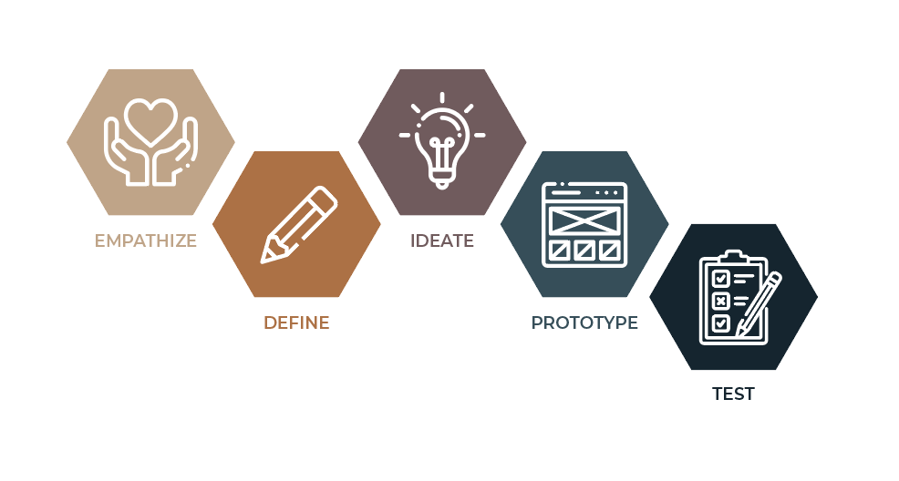
What do you hate most about the website you love? What do you love most about the app you hate? User experience is all about meeting the user’s need, also known as solving their problem. In the UX Design Thinking process, the first step to problem-solving is understanding what the user is experiencing. Gaining insight into the user’s experience is achieved by finding ways to empathize with them. The empathy stage involves various research methods, including conducting interviews, taking surveys, observing users in their environment, empathy mapping, and more. These research findings assist UX professionals with transitioning into the next step of the process: define. 

The Define Stage

After Empathize, Define is the second stage in the Design Thinking Process

Why Define?

The define stage of the Design Thinking process identifies a specific user problem that needs to be solved. This stage determines what you want to address before committing time and resources to execute other design thinking steps, including ideation, prototyping, and testing. Within this stage, you fixate on a particular challenge and set a goal you can actively work toward realizing. The result of the define stage is a clear objective, better known as a problem statement. 

Analysis vs. Synthesis

Defining the problem is accomplished by synthesizing the data gathered in the preceding step. In Design Thinking, analysis and synthesis can occur within any stage. However, the general rule of thumb is that the empathize stage is achieved through analysis, while the define stage is achieved through synthesis. 

Author/Copyright holder: Teo Yu Siang and Interaction Design Foundation. Source: Stage 2 in the Design Thinking Process: Define the Problem and Interpret the Results by Rikke Friis Dam and Teo Yu Siang

“The relationship between the empathize and define stages can best be described in terms of analysis and synthesis. In the empathize phase, we use analysis to break down everything we observe and discover about our users into smaller, more manageable components—dividing their actions and behavior into ‘what’, ‘why’ and ‘how’ categories, for example. In the define stage, we piece these components back together, synthesizing our findings to create a detailed overall picture.”

Emily Stevens, How To Define A Problem Statement: Your Guide To The Second Step In The Design Thinking Process, Career Foundry

Developing a Problem Statement

A problem statement is an essential component of a Design Thinking project. It serves as the guiding light, as it provides a focus on the user’s needs, maintains direction and structure, and encourages optimism. It can also be called a user needs statement, a how might we statement, or a point-of-view (PoV) statement. UX professionals aim to write clear problem statements that foster ideation and support finding a solution. 

Aaron Benjamin’s problem statement format. Source: Design: How to define the problem.

Though problem statement formats vary, Aaron Benjamin of Prototypr.io recommends formatting a direct, solution-seeking problem statement, using minimal characters, like so:  [Action verb]  is a challenge for  [user]  because  [insight] 

Problem Statements in Action

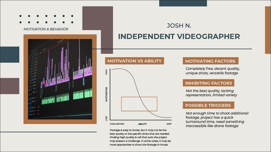
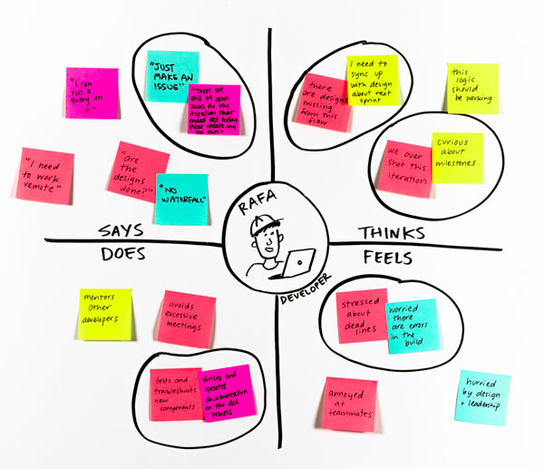
In a previous blog post, I walked through an empathy mapping exercise. While watching an episode of Undercover BossI observed the CEO of Build-A-Bear Workshops, Sharon Price John, as she shadowed her employees to gain insight into how guests and employees experience her company. 

Build-a-Bear Workshop’s new Discovery store model storefront, implemented by new CEO, Sharon Price John.

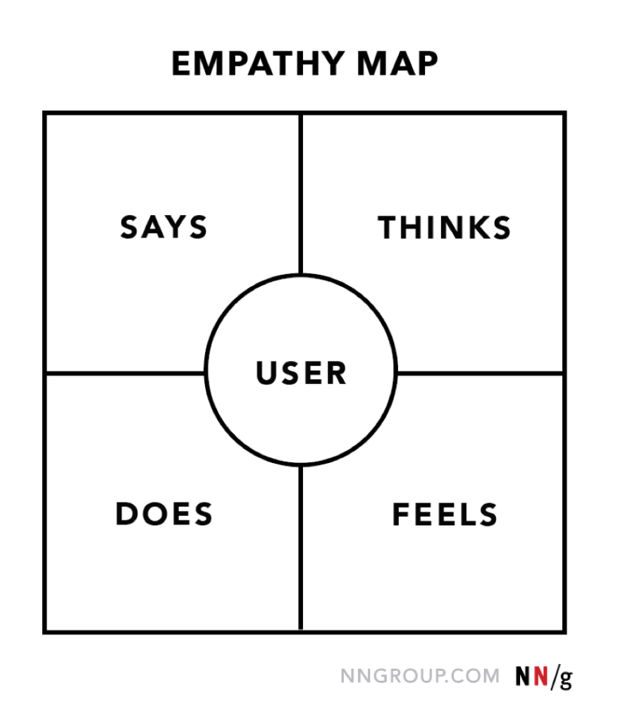
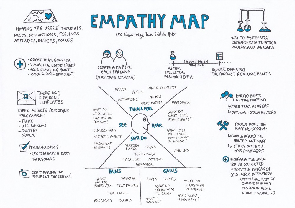
In my exercise, I created two empathy maps to analyze the experiences of Sharon and Leney, a Build-A-Bear associate. Empathy mapping is a way to observe a user by taking note of what they say, do, think, and feel while interacting with a product or service. My empathy mapping exercise also covered what each user heard, saw, their pains, and their gains. 

This week, I revisited the Undercover Boss episode, and my two Build-A-Bear empathy maps to craft problem statements. Using Aaron Benjamin’s problem statement format, here are my findings:

  • Using the Smile-with-Me station is a challenge for Build-A-Bear guests because there are no clear directions to communicate how to utilize the station. During Sharon’s Discovery store model visit in Northridge, CA, she asks Bear Builder Leney what she thinks of the new store model in comparison to the old, Heritage model. Due to Leney’s childhood experiences with the store, Leney identifies most with Build-A-Bear’s old store model, the Heritage model, as opposed to Sharon’s new Discovery model. Leney especially loved the Fluff Me station, where kids could give their stuffed animals an air bath. Unfortunately, this memorable step in the bear-making process was replaced with new Smile-with-Me station. Leney explained that the station was confusing and misleading for guests because there are no clear instructions. Parents assume that the store will take a photo of their guests, and fail to understand that the station is actually intended for them to take the picture themself. Altogether, the new station is less special and engaging for guests than the Fluff Me station.
  • Stuffing bears is challenging for Sharon because it requires experience and mastery.  During the same store visit, Leney challenges Sharon with using the stuffer machine. This machine involves a foot pedal that starts the machine when stepped on, and a hose which shoots out stuffing. As soon as Sharon starts stuffing, she misses the inside of the bear she is holding, and stuffing shoots out everywhere, startling guests and making a mess within the station. Sharon struggles while stuffing bears because mastering the stuffer machine requires experience. Various stations at the store require hands-on learning, which may not be suitable for every employee. There are not clear instructions on how much pressure to put on the foot pedal or what angle employees should hold the bears over the hose to direct the stuffing appropriately. 
  • Preparing a palette in Build-A-Bear’s “bearhouse” is a challenge for warehouse employees because the steps are inefficient. During Sharon’s distribution warehouse visit in Colombus, OH, Bearhouse employee Solomon, gathers boxes on his cherry picker alongside Sharon. After cherry picking, his coworkers slide all of his boxes down a metal ramp as he goes to the loading dock to manually re-stack and rescan his boxes on a palette as they come down the ramp. Solomon explains that the boxes need to be scanned and stacked on the palette quickly, in a particular way to avoid the lines backing up. The steps of cherry picking, scanning, stacking, sliding, rescanning, and re-stacking are inefficient, as steps are repeated unnecessarily. These repeated steps slowdown the warehouse workers at the time they need to move fast the most.
  • Learning the register is challenging for new employees, including Sharon because there is no established training method. Sharon visits a Heritage model store in Whitehall, PA and meets Nick, a Build-A-Bear Bear Builder who walks her through the entire bear-making process. The final step of the process is checking the guest out. Nick gives Sharon his own crash course for using the register and then tasks her with checking out a few guests so that she can get some practice. As Sharon checks customers out, she mistakingly rings items up multiple times and forgets to complete a register step to process a customer’s payment. The expressions of confusion and frustration on the customers’ faces indicate that the store may need to update their register training with a training mode so that employees can practice safely instead of learning as they go.
  • Training new employees is a challenge for Kendall because Build-A-Bear’s training manual does not suit everyone’s learning style. While training Sharon, Kendall, a Build-A-Bear Assistant Manager in Alpharetta, GA, shares that she has crafted and customized her own training manual using the store’s old and new manuals. Although she often refers back to the store’s latest manual, she maintains key principles from both manuals to help new associates learn better. Sharon has an issue with this because she believes that Kendall should only be following the new training manual. After further discussion with Kendall, Sharon learns that Kendall is being inclusive and considerate of her employees. Sharon devises a good solution to this problem that entails crafting a quick start manual suitable for all employees and all learning styles. 

Final Thoughts

Defining the problem is a vital step in the Design Thinking process. Without a solid problem statement, your team will lack focus, direction, and purpose in meeting your user’s needs. Although it may seem like identifying a problem is easy to accomplish, before jumping into ideation, prototyping, and testing, it is important to slow down and commit time to formulate a notable problem statement. A well formulated problem statement results in an effective solution, so take your time!

User Personas in Practice

Did you know that the creators of the apps you use, the software you utilize, the websites you visit, the services you make use of, the products you love, and more have you in mind? Yes, you! Your demographics, behaviors, goals, motivations, pain points, everything that defines who you are as an individual in relation to their product or service. They’ve even gone as far as giving you a nickname and an archetype. Based on characteristics they have observed, you could be called “The Computer Nerd,” “The Influencer,” “The Solution Seeker,” or “The Planner.” One way or another, you fit into a category they have developed, called a persona.

User Personas Explained 

In user-centered design and marketing, a persona is a profile created to encapsulate user-related research. Nielsen Norman Group explains that “user personas are fictitious yet realistic representations of your target users. They act as a multipurpose tool used to drive many important product development tasks. Created out of complex user data, personas take on a format that is meaningful and creates user empathy among your development team, ensuring your users are always the focus of your efforts.” 

After researching and becoming familiar with the users of a particular product or service, marketers and user-experience professionals craft personas, grouping kindred users within one specific profile. The result is a handful of model personas that user researchers and designers can keep in mind while modifying and improving their product or service. Having a name, a face, and various descriptors, each persona resembles a single human user while representing a larger group of users. 

Playbook UX – Creating Personas for User Experience Research

Persona Worksheets

Completing a persona worksheet is a great way to organize user research and develop a persona. There are countless examples of persona worksheets utilized today, but many of them are comprised of similar sections. Altogether, all persona worksheets achieve the same goal. 

I recently completed a website analysis exercise on two open-source stock imagery websites, Pexels and Unsplash. To gain an understanding of the persona creation process, I downloaded the persona worksheet pictured below and created two persona profiles. I chose to create these profiles for Pexels because Pexels offers stock imagery and footage. Pexels’s inclusion of footage likely draws more diverse users to their site and app. With this knowledge, I felt this was a good way to practice developing personas with different goals and motivations. Although they may be related, I desired for my personas to be distinct. Following are my first Pexels Personas: Sola, the Driven Designer, and Josh, the Independent Videographer. 

Example user persona notepad utilized for my exercise. Source: A Guide to Personas – Ben Ralph

Pexels Persona: Driven Designer

To begin the persona creation process, I thought about myself. To understand my behavior, I needed to practice a little self-searching. Asking questions like, “why do I use Pexels?,” “what am I looking for?,” and “what do I need?” assisted me in identifying my goals, motivating factors, inhibiting factors, and possible triggers. While it took some time to get accustomed to viewing myself objectively, determining my motivation and behavior opened the doorway to pinpointing my influencers and environment. 

My first persona, modeled after myself, is a Driven Designer. This user primarily seeks imagery to include in design projects. She has access to other sources of stock imagery and can also utilize photos she already has the rights to that were taken in-house or used in previous design projects. However, this individual uses Pexels to find unique images swiftly. 

Pictured above: The first two sections of the Driven Designer’s user persona. “First Impressions” encompasses her demographics and direct quotes. “Motivation & Behavior” covers her goals, current journey, motivations, inhibiting factors, and possible triggers.

Search results of her company’s paid stock imagery site contain an innumerable amount of options, making it difficult for her to find a relevant and relatable image that aligns with her vision or narrow down the endless possibilities the site offers. Searching her organization’s in-house photography may limit her because some of the photos may be targeted, outdated, overused, or unsuitable for her current project. She’s also looking for that special spark – a contemporary image that is captivating and meets her needs for creativity and beauty within her design.

Pexels helps her achieve her goals by offering just enough choices and maintaining an eccentric feel. Furthermore, Pexels is completely free. If she downloads an image and later decides not to incorporate it into her design, she’s guilt-free. If she downloads multiple images, it does not impact her or her company’s budget.

To find out more about the Driven Designer, download the full persona. 

Pexels Persona: Independent Videographer

My second persona embodies some of the people I have encountered in my field. Unlike my first persona, this persona is more straightforward with fewer underlying goals and motivations. However, this persona was much more challenging to develop because I had to contact other people, reflect on some of my colleagues, brainstorm, and research online. Some of my searches included questions like, “Why do people need stock footage?,” and “Who uses stock footage?” I found that stock footage is often sought after for space-filler content. Enter Josh, the Independent Videographer.

Pictured above: The first couple sections of the Independent Videographer’s user persona. “First Impressions” covers demographics and direct quotes. “Motivation & Behavior” covers his goals, current journey, motivations, inhibiting factors, and possible triggers.

This user searches Pexels for stock footage to fulfill his goals of saving time, money, and resources and finding b-roll. He uses Pexels less often than the Driven Designer because most of his shots are preplanned. However, mid-project, he may find that something is missing, especially if the project is lengthy, warranting dynamic shots. At this point, this individual considers outsourcing footage to keep pace with his deadlines instead of putting effort into shooting new footage, which may require time, money, props, studio space, lighting, subjects, specific equipment, and more. Josh is seeking high-quality footage that he can toss into his current project timeline for a few seconds without hesitating. His relationship with Pexels is a hit-or-miss affair because there are no workarounds for the footage blending with the project, capturing his intended shots, or sustaining the quality he needs.

For more insight on the Independent Videographer, download the full persona.

Final Thoughts

You may have never thought about it before, but you likely bear a resemblance to “Nerdy Nancy,” “Focused Fred,” or another persona, developed by the user experience researchers and designers of your favorite products and services. Classifying you within a persona helps user experience professionals keep you at the forefront of their minds. It helps them remember what makes your experience significant, matters to you most, and keeps you coming back. Developing and utilizing user personas is yet another way to practice empathy in user experience design.

Undercover Empathy

Empathy’s Impact on User Experience

Empathy. It is the ability to understand and share the thoughts, feelings, and experiences of another individual. Being empathetic is a fundamental way to connect with others and remain humble, sensitive, and respectful. Empathy is also the first step in design thinking, a human-centered process in User Experience design. 

Design thinking identifies the needs of a user and seeks to meet these needs. Without empathy, design thinking cannot be accomplished. To understand the challenges and needs of a user, the creators of a product or service need to be aware of the user’s perspective and experiences. This happens by entering the world of the user to see what they think, hear what they say, observe their actions, feel their feelings, and more. once these reactions and emotional responses are noted, the designer can use these findings to develop a product and/or service that meets the user’s needs and addresses their issues.


“Engaging with people directly reveals a tremendous amount about the way they think and the values they hold. Sometimes these thoughts and values are not obvious to the people who hold them. A deep engagement can surprise both the designer and the designee by the unanticipated insights that are different from what they actually do – are strong indicators of their deeply held beliefs about the way the world is.”

– d. School Bootcamp Bootleg, 2013

Undercover Boss

Courtesy of CBS

Since February 2010, an American reality television series called Undercover Boss has disguised high-level corporate executives and placed them into lower-level positions within their organizations. This grants the “boss” the opportunity to witness how their employees execute the processes and procedures they have implemented. Through this mission, the boss unveils new findings, including the perspectives of their employees and customers, the spirit of their workforce, what works for their company, where they need improvement, and more. 

the Undercover boss experience resembles how UX designers empathize with their users. UX professionals empathize by taking surveys, asking questions, performing studies, and more. Similarly, through Undercover Bos, CEOs and Presidents learn work strategies, ask questions, interact with customers, and place themselves in the shoes of their employees. Considering that some of these organization leaders may not have worked in lower level roles before, this experience teaches them to empathize with their employees.


Empathizing in Build-A-Bear Workshop

Build-a-Bear Workshop’s new “Discovery” store model (left) and old “Heritage” store model ( right).

Season 8, Episode 1 focuses on Sharon Price John, the President and CEO of Build-A-Bear Workshop, a “global retail chain where customers can design and create their own stuffed toys.” As a first-time CEO, Sharon is excited about reshaping Build-A-Bear Workshop’s future. She looks forward to seeing how her employees and customers are taking to her new store model and other recent changes. She wants to observe Build-A-Bear operations to find out what is working well and what may need improvements. Under her alias, “Jessie,” she walks through a day of work alongside four different employees: Leney, Nick, Solomon, and Kendall. 

Sharon disguised as Jessie

Sharon’s first stop is in Northridge, CA. She meets with Leney, a dedicated Bear Builder working in a Build-A-Bear store that has recently implemented the Discovery store model. This new store model was developed by Sharon and her team. 

I walked through the episode alongside Sharon and Leney and observed their Build-A-Bear experiences. Through empathy mapping, I gained an understanding of their perspectives and passions. I’ll start with Sharon.

Undercover Boss, Season 8, Episode 1: Build-A-Bear

Empathy Mapping: Sharon, President and Chief Executive Officer

Sharon’s Background

In June 2013, Sharon Price John became the President and CEO of Build-A-Bear Workshop. Before Sharon joined the company, Build-A-Bear experienced a financial decline from 2008 to 2012. This resulted in 22% of the company’s North American locations being declared unprofitable. Sharon previously served as Stride Rite Children’s Group’s President and has detailed experience working in big toy and children-focused companies. Some of the companies she has successfully supported include Hasbro, Mattel, Wolverine World Wide, and DDB Needham Worldwide. She has experience in advertising, marketing, product development, and change management. 

In her field, she has been recognized for fixing businesses and restoring declining brands. She is well-versed in reinventing historic brands and making them appeal to the modern customer. As a first-time CEO, Sharon joined Build-A-Bear with the hope of reinventing the brand and refreshing it for the new consumer and millennial. Sharon worked with her team to introduce a new store model, incorporating new colors and a new look and feel to make the store more relevant and appealing. 


Empathy Mapping: Leney, Bear Builder, Northridge, CA

Leney’s Background

Leney has been a loyal guest at Build-A-Bear since she was about five years old. Now, at age 17, Leney works as a dedicated Bear Builder in Build-A-Bear’s store located in Northridge, California. During her childhood, Leney and her younger sister made memories and bonded together in Build-A-Bear Workshops. Due to her childhood experiences with the store, Leney identifies most with Build-A-Bear’s old store model, the Heritage model, as opposed to Sharon’s new Discovery model. Leney especially loved the Fluff Me station, where kids could give their stuffed animals an air bath. This step in the bear-making process was more memorable and special for guests than the new Smile-with-Me station. 

Leney lives at home with her younger sister, father, and paternal grandmother. She does not talk to her mother or any family members on her mother’s side. Leney’s mother left when she was about 13 years old. Additionally, she was never truly present, so Leney’s grandmother raised her. Currently, Leney is trying to get the most out of living at home with her grandmother because her grandmother has lupus, which is taking a toll on her health. Her father is disabled, so she works three jobs to try and support her family. Despite her many responsibilities and the challenges in her personal life, Leney keeps a smile on her face and works enthusiastically. She is a model employee, as she makes the Build-A-Bear experience exciting and enjoyable for her customers.


Results

Unlike other episodes of Undercover Boss, this episode ended on a great note. Sharon was able to tap into who she truly is emotionally and gain insight into why Build-A-Bear’s guest experiences are positive and meaningful. 

“I feel terrific about the future of Build-A-Bear. We have wonderful employees that are dedicated to this company and dedicated to the mission. I think what I’ve learned about myself is that to get to CEO there’s been a part of myself that I’ve tried to hold back, an exuberant, joyful part. But this company needs me to be like my real self.”

– Sharon Price John, President & CEO, Build-A-Bear Workshop

Additionally, Sharon recognized a few setbacks in the company’s operational procedures and her new store model. She learned of areas she can focus on improving for the future of her guests, employees, and the Build-A-Bear company. 

Finally, this experience helped Sharon practice empathy toward her employees. Learning about Leney’s life experiences as a 17-year-old impacted Sharon directly because she has a 17-year-old daughter. In conversation with Leney, Sharon stated, “I can’t imagine her having some of the responsibilities and burdens you have on you at this age.”

Sharon gifted Leney $10,000 for her own personal use, $15,000 to cover medical bills for grandmother and father, and a college fund for Leney’s younger sister. Leney broke into tears, thanking and hugging Sharon numerous times for her consideration and generosity.


My Experience with Undercover Boss

Undercover Boss is a unique and innovative way for high-level executives who sit in an office all day to empathize with their on ground employees. Additionally, this experience is a great opportunity for employees and executives to close the gap between their respective roles and engage one another. Although Sharon’s typical day at work looks drastically different from Leney’s, Nick’s, Solomon’s, and Kendall’s, Sharon was able to share in their experiences and draw connections between their lives and hers. 

Each of the employees had personal challenges that had the power to affect their work ethic and their worldview. Surprisingly, each of them channeled their stretching experiences into positive energy, staying optimistic and keeping a genuine smile on their faces despite their hardship. Sharon recognized that her employees were ordinary people striving for better. She realized that they were loyal, dedicated, enthusiastic, compassionate, and caring. They embodied the mission of Build-A-Bear excellently. This experience showed Sharon that she too could open up, be sensitive, and be herself at Build-A-Bear, just like her employees. Many of her goals within the company aligned with her employee’s goals.

Empathy Mapping: A Key to Understanding your User

We have all heard the idiom that references walking a mile in someone else’s shoes. In Harper Lee’s To Kill a Mockingbird, the first lesson that Scout learns from Atticus is to put yourself in the place of other people. “You never really understand a person until you consider things from his point of view…until you climb in his skin and walk around in it,” Atticus says. Whichever way it has been phrased to you, you likely identify “stepping into someone else’s shoes” with empathy. 


What is Empathy?

Empathy is the ability to understand and share another person’s thoughts, feelings, and experiences. This is most achievable when we set aside our assumptions, labels, judgments, and preconceived notions. Empathy allows us to feel each other’s pain, gain perspective, and acquire true understanding and appreciation of one another. To remain sensitive, civil, respectful, considerate, and humane, humans must remain empathetic.


Empathy is the most important human skill in the digital age.

– Katri Saarikivi, TEDxYouth@Kolmikulma

Empathy in UX

In user experience design, the first stage of the Design Thinking process is “Empathize.” This stage is all about engaging the world of your user, learning about them and their experiences, and finding out their needs and challenges. Empathizing with your user can come about through multiple practices, including conducting interviews, taking surveys, performing user testing, and more. As a UX professional, empathy mapping is an additional activity you can use to engage and advocate for your end-users. 


Empathy Mapping Explained

So, what is empathy mapping? In his Career Foundry article, Camren Browne explains that “Empathy maps are an efficient tool used by designers to not only understand user behavior but also visually communicate those findings to colleagues, uniting the team under one shared understanding of the user.” The empathy map, created by Dave Gray, is a way to gain emotional intelligence and insight from target groups like customers and users. Gray explains, “This particular tool helps teams develop deep, shared understanding and empathy for other people. People use it to help them improve customer experience, to navigate organizational politics, to design better work environments, and a host of other things.” 

What is an Empathy Map? by PlaybookUX

How to Empathy Map

Pictured below, an empathy map is a chart split into four quadrants with the user at the center. The quadrants can often overlap, and a user’s response may fall into multiple spaces, but the key is to pick one. Additionally, if a user’s responses resemble one another, they can be grouped and categorized.

Empathy Map Examples: Nielsen Norman Group, IBM, UX Knowledge Base Sketch

Here’s how you use each quadrant:

  1. The “Says” quadrant is where you write down what the user says out loud about the product/service. This quadrant contains direct quotes. 
  2. The second quadrant is called the “Thinks” quadrant. Unlike the recordings from quadrant 1, what the user thinks is implicit. Here, you gather what the user thinks, but does not say. You can derive these things through the observation of your user.
  3. Next is the “Does” quadrant. This is a space to record your user’s actions. You should take note of the way the user interacts with the product/service.
  4. The final space, “Feels,” contains the user’s emotional state. These items can be implicit as well, so observation is necessary. 

If you end up with an empty quadrant at the end of the exercise, that’s a clear sign to double back, do more research, and gain more insight. 


Why Empathy Mapping is Important

In UX, empathy mapping is a great strategy to understand a user’s experiences, needs, and goals in a unique and organized way. According to IBM, “it’s important to remember that you are not your users.” Observing what a user says, thinks, does, and feels highlights possible challenges the user may be experiencing first-hand. This helps UX professionals find solutions to these challenges. 

Furthermore, empathy maps help UX professionals capture who a user is. It is an innovative way to perform research on the people or type of person who use(s) a product/service. Once you have gained a deeper understanding of your user and their needs, you can relay the information you learned to others effectively. The more understanding you and your team have, the more capable you are to meet your user’s needs. Moving forward, this helps shape your objectives and deter bias.


Final Thoughts

User experience focuses on understanding how a user interacts with a product or service. To achieve this understanding, UX professionals must view their users as humans, not consumers. They must immerse themselves in the environments of their users, and recognize and acknowledge their perceptions, ideas, emotions, and overall interactions with the product or service. Empathy mapping is a nuanced, yet powerful way to hear what a user has to say, gather their thoughts, observe their actions, and capture their feelings. It is a fruitful method to onset Design Thinking and practice empathy.

Pexels Inspires Me; Unsplash Makes me feel productive

Take a moment to think about a website you visit frequently. How does it make you feel? Do you appreciate the navigation, colors, typography, and functionality? Why or why not? What aspects of the site meet your needs? Which of your needs are not met? If you haven’t figured it out by now, it’s time to get in touch with our feelings. 


Emotional Design, UX, and UI

In my last blog post, I briefly touched on emotional design. I explained that designing a product or service requires the designer to consider the emotions their product/service may evoke in their user. Emotions affect a user’s views, interactions, and value of a product or service. People are driven by the way things make them feel. This idea rings true for the websites you frequent, as well as the sites you no longer visit. 

When you visit a website, two things come into play: 

  1. The overall functionality and practicality of the website, also known as the User Experience (UX).
  2. The look and feel of the website, known as the User Interface (UI).

These two things often overlap. They affect how you view and experience the site and impact your emotional response.


“Users perceive objects that are aesthetically pleasing as being more effective.”

— Don Norman, Emotional Design

Assessing Your Emotional Response

To assess your emotional response to a product, service, website, etc. you can formulate sentences using the following format: 

________ makes me FEEL _________ because my NEED for __________ is OR is not being met. 

You may benefit from using a feelings inventory list and a needs inventory list for further assistance in completing your sentences. 


My Website Analysis Exercise

Recently, I utilized these tools to walk through a website analysis exercise. I chose to analyze my emotional responses to two websites I visit often, Pexels and Unsplash. Both of these websites are resources for free stock imagery. Photographers and artists can upload their work to both sites, which creates a profile for them, showcasing their work and helping them generate a following. Meanwhile, users can search for completely free, high-resolution imagery to download instantly and incorporate into their projects, including commercial ones. As a graphic designer, I frequent both of these sites, but, for some reason, I have yet to cut one of the sites out. My analyses revealed that, although the sites are very similar, there are minute differences between the two that affect my use of either site. 

Pexels vs. Unsplash

Through twenty FEEL-NEED statements (ten per site), I found that I visit Pexels when I am seeking inspiration. Alternatively, Unsplash is my go-to when I want to remain productive and efficient in my workflow. Pexels is often my destination when I have more flexibility and want to address my needs for artistry, creativity, inspiration, and spontaneity. Unsplash meets my needs of maintaining order and organization and staying calm and focused while working. I consistently benefit from both websites. However, I may favor one website over the other depending on the flexibility of my schedule, the type of project I am working on, and the intensity of my current work session. 

Pexels for Pleasure

My use of Pexels and Unsplash correlates directly with the functionality and aesthetic features of both sites. Pexels fulfills my need for beauty and expression by utilizing a four-column layout that spans the entire width of the page. It also features strong contrast between its dark menu bar and light background. Additionally, Pexels’ homepage incorporates both stock photography and active videography, which sparks my curiosity and increases my engagement with the site. As you scroll through the homepage, the photo blocks transition in color ever so slightly, while videos play on a loop. This makes me feel refreshed because my needs for attention to detail and distinctiveness are met. I can easily be immersed by the Pexels site due to highly captivating imagery.

Unsplash for Business

Unsplash’s homepage is similar to Pexels’s, using a column layout with a continuous scroll, housed underneath a full-bleed search bar. However, there are only three columns in the layout, leaving room on both sides for whitespace. This helps maintain balance and structure. The site is a bit more stark and bland, maintaining the use of a light color in the menu bar and background. Furthermore, the featured photos transition randomly, and there are no stock videos on this site. When I visit Unsplash, it’s strictly business; no distraction. When hovering over an Unsplash photo, the download button is prominent, followed closely by the like and add buttons. I search for what I need, download it swiftly, and return to my project. This happens instinctively.


Final Thoughts

So why do we choose Amazon over eBay? Google over Bing? Youtube over Vimeo? Or both sites at varying times? The interface and experience of the website feed directly into our feelings and evoke emotional responses. If you have a positive experience with the site, or it appeals to you aesthetically, or both, that website is likely to become a staple site in your browsing history.

How Products and Services Evoke my Emotions


What’s your favorite device? What service have you been raving about to all your friends and family? Is there a product you used recently that frustrated you? Why?

According to Don Norman, an American researcher, professor, author, and the Grand old man of user experience design, emotional engagement is a key factor to consider when designing a product or service because people are emotional. Emotions are powerful. How we feel about a product or service determines how we value it.


“Everything has a personality: everything sends an emotional signal. Even where this was not the intention of the designer, the people who view the website infer personalities and experience emotions.”

Don Norman, Grand Old Man of User Experience

This week, I took a look at a selection of my everyday products, devices, and services to assess the way they make me feel. I analyzed my emotional response to three things using the following phrase:

________ makes me FEEL _________ because my NEED for __________ is OR is not being met.

(In this case, my needs are met.) Here is why I value herbal tea, Amazon Prime, and my Vivint Video Doorbell Camera.


Product: Herbal Tea

Herbal tea makes me feel relaxed because my needs for resthydration, and immune support are being met. 

I drink herbal tea regularly, especially during colder seasons, because it gives me extra warmth and comfort. Drinking tea is calming and provides a way to prepare for the day or unwind at night. Healthwise, tea is an additional way to stay hydrated and support my immune system. There are quick tea remedies for various ailments, including a sore throat, common cold, and stomach ache, and, for me, they work! Last week’s stomach ache dissolved, thanks to Traditional Medicinal’s Belly Comfort Tea.

Service: Amazon Prime

Amazon Prime makes me feel satisfied because my needs for accessibility and efficiency are being met. 

You may already be familiar with Amazon Prime’s same-day, overnight, one-day, or two-day delivery. I benefit from Amazon’s speedy delivery consistently. Although I occasionally return products, I am generally satisfied with the variety of products and prices Amazon offers and how quickly my orders arrive. Shopping on Amazon is much easier than visiting numerous stores to compare products and prices, especially during a pandemic, in which some items may not be as accessible. I also appreciate the detailed reviews that customers write, allowing me to make more informed decisions when purchasing an item. So what are my most recent Amazon buys? A grow light for my houseplants (since it’s winter and there’s not as much daylight) and a 4-in-1 wireless charger to charge my Apple watch, apple pencil, iPhone, and AirPods all in one place. 

Device: Vivint Video Doorbell Camera

Vivint’s Video Doorbell Camera makes me feel conscious and informed because my needs for presence and security are being met.

When someone presses our doorbell, it rings throughout the house. I also get a notification on my phone that says, “someone rang your doorbell.” The doorbell’s camera records live video, alerting my husband and me when someone comes to the door or when a package is left on our doorstep. Using our devices, we can monitor our door front at any time and replay video clips to keep track of activity around our home. Being aware of my surroundings is very important to me, as I am very cautious and concerned with my safety. Our home security system and doorbell camera make me feel more secure and comfortable, especially since I am new to home, neighborhood, county, and surroundings. Here’s a video of my puppy dashing out of the house while I attempt to retrieve a package.


Looking Ahead

So what does this mean for designers? Simply put, emotions affect a user’s views, interactions, and value of a product or service. Therefore, designers should seek to incorporate emotional design in their work by creating “designs that evoke emotions which result in positive user experiences.” Evoking your user’s feelings prompts more engagement with your product/service and more attachment to it. Emotion is a way to connect with your user(s), causing them to create a lasting relationship with your brand. Effective emotional design makes the user’s experience more enjoyable, memorable, and personal. In any form of design, it is important to consider your audience. However, alongside their needs and their desires, their feelings are valid too. 

Redesigning the Gift-Giving Experience: My Take on Stanford’s Design Thinking Crash Course

This week, I had the opportunity to partner with a classmate, Chris Blake. Chris is a Game Developer and an adjunct professor at Quinnipiac University. We sat down for 90 minutes to go through A Virtual Crash Course in Design Thinking, by Stanford University’s Hasso Plattner Institute of Design, also known as the d.school. This crash course “lets you experience one of the d.school’s most popular learning tools.”

The course walked us through a collaborative project called the “Gift-Giving Cycle.” The project consists of multiple sections that walk students through the basic principles of design thinking.


DESIGN THINKING: a methodology for creative problem-solving.


My Thoughts of the Course

Overall, I enjoyed the Design Thinking Crash Course. At first, the course was somewhat intimidating. However, as Chris and I worked through each section, my interest and curiosity grew. Although I attended a class alongside Chris last semester, I learned more about him, his life, his loved ones, and who he is as a person through this 90-minute crash course. I also gained more understanding of the design thinking process during this time. 


My Perception of Design Thinking

Before taking the course, I had an unclear understanding of the five stages of design thinking. Furthermore, I was confused about design thinking altogether, as it seemed like everyone had their own design thinking definition and process. After taking the course and walking through the stages, I can differentiate between each of the stages distinctly. I also have a deeper understanding of the non-linear and iterative qualities of design thinking.


Surprising Aspects

The course surprised me most in two ways. First, I did not think that a problem statement could be identified and defined in just four steps. Chris informed me that he gave his brother a bread-baking book for Christmas. When I dug deep, he explained that his brother was a recent divorcee, and this would have been his first Christmas alone. Further discussion revealed that Chris wanted to cheer his brother up, and he cared about his well-being.

From here, my problem statement surfaced: Chris needs a way to encourage other people because he understands that others need support while experiencing difficult life challenges. Voila! Just like that, I was able to identify Chris’s needs.

My second surprise came about while ideating. I felt like my ideas were rushed, basic, and likely to be scrapped. To my surprise, Chris could identify with a number of my solutions. He narrowed it down to one solution that I developed further and finalized. 


Challenging Aspects

One of my main challenges was the 90-minute timeframe. I initially thought 90 minutes was a long time to work through the course. However, as I progressed, I felt rushed. I felt I needed more time to spark my creativity and innovation. I also struggled with the quantity over quality approach to the ideation stage because I wanted my solutions to be concrete. In hindsight, I understand the purpose of the way the course is formatted. It gave me a good glimpse into the design thinking process as a whole.


What I Would do Differently

If I were to do the course over, I would likely create a physical prototype. My final solution was more of an experience, not a physical item. While prototyping, I felt limited. I took to creating a visual representation digitally. I now understand that prototyping also requires thinking out of the box. Moving forward, I would like to improvise better and find a way to represent the experience effectively. This could mean using play-doh or legos to model the experience. 

Play-Doh Prototyping Example from “Prototyping with Play-Doh,” Sheryl James

Final Thoughts

If you would like to explore a new approach to creative thinking and problem solving, grab a friend and check out Stanford’s Design Thinking Crash Course. This course will challenge you to address your problems head-on, push you to utilize your imagination, motivate you to find a workable solution, and encourage you to step out of your comfort zone.

Stanford Design Thinking Virtual Crash Course

The Relevance of Design Thinking

What’s your go-to method of problem-solving? Have you tried design thinking? 

InVision defines design thinking as “a process that seeks to solve complex problems by approaching it from the user’s perspective.” This process is useful in solving problems identified across varied platforms, fields, professions, industries, countries, and beyond.


“Design thinking is a human-centered approach to innovation that draws from the designer’s toolkit to integrate the needs of people, the possibilities of technology, and the requirements for business success.”

Tim Brown, Executive Chair of IDEO

Design Thinking in a Nutshell

The design thinking process has one key point of focus: the user. It identifies the needs of the user and seeks to meet these needs. “Design thinking is both an ideology and a process that seeks to solve complex problems in a user-centric way. It focuses on achieving practical results and solutions,” writes Emily Stevens from InVision. Through five stages, design thinking yields creative and innovative solutions to complex problems.


Design Thinking Stages

Design thinking is encapsulated by five actionable stages: Empathize, Define, Ideate, Prototype, and Test.

The 5 Stages of Design Thinking by InVision
  • Empathize: This stage seeks to understand your target audience and the problem(s) they face. This is accomplished through immersing yourself in the environment of your audience. Ask questions, take surveys, seek experiences, and dig deep.
  • Define: After gaining insight into your user’s perspective, you can use what you learned to define the problem. In this stage, the goal is to formulate a problem statement. The problem statement focuses on the user’s core needs. It is a guiding point for all subsequent stages. You can view it as a mission or vision statement.
  • Ideate: The third stage involves generating ideas. This is where you brainstorm ways to address your user’s needs. Viewing your problem in alternative ways and thinking outside the box is encouraged. In this stage, it is more important to come up with multiple feasible ideas. Quantity wins over quality here. 
  • Prototype: Prototyping involves selecting the best of your ideas and creating an inexpensive version of your solution(s). This experimental stage is a chance to create something tangible. Prototypes are often created using whatever materials may be available, including paper, tape, paper clips, play-doh, popsicle sticks, etc. The product is a simple first draft of your main idea. 
  • Test: In the testing stage, your user will interact with your prototype and provide feedback. This stage helps you determine whether your solution is valid or if it needs reworking. Although this is the final stage, your results may lead you back to prior stages, or even as far back as identifying additional needs and redefining the problem.

Design Thinking Benefits

So why is design thinking relevant? Here are some benefits of design thinking.

  • Design thinking helps you gain a deeper understanding of others. It is not focused on a vague problem or hypothetical scenario. Design thinking addresses the needs of real users with valid experiences. It calls you out of your comfort zone into the reality of other people. Instead of judging a situation and making assumptions, design thinking challenges you to ask questions, observe experiences, assess perspectives, gain insight, and think deeply. 
  • Design thinking encourages everyone to wear their creative hat. Anyone can be a design thinker. According to IDEO, design thinking “allows people who aren’t trained as designers to use creative tools to address a vast range of challenges.” Furthermore, Fast Company writes, “There are no judgments in design thinking. This eliminates the fear of failure and encourages maximum input and participation. Wild ideas are welcome, since these often lead to the most creative solutions. Everyone is a designer, and design thinking is a way to apply design methodologies to any of life’s situations.”
  • Design thinking promotes thinking outside the box. It encourages addressing a problem from various angles. Despite the challenges, design thinking enables optimism regarding the solution. It is an iterative, flexible, and non-linear process. Therefore, it promotes creative thinking, highlights endless possibilities, and generates new ideas. It pushes beyond limits and outside borders. Clint Runge explains that, instead of thinking outside of the box, he thinks “on its corner, its flap, and under its barcode.” 
  • Design thinking produces real results. Stevens suggests that design thinking focuses on achieving practical results and solutions that are technically feasible, economically viable, and desirable for the user.
Kaiser Permanente and Design Thinking

Here’s a real-world example. In 2003, IDEO collaborated with Kaiser Permanente to implement design thinking in hopes of enhancing Kaiser’s patient and employee experiences. “Close observation of actual shift changes, combined with brainstorming and rapid prototyping, produced new procedures and software that radically streamlined information exchange between shifts. The result was more time for nursing, better-informed patient care, and a happier nursing staff” (Harvard Business Review, June 2008).

As a patient with a chronic illness, I can attest to these results first hand. Growing up with Sickle Cell Disease, I experienced multiple pain crises every year. Some of these crises could be managed at home, but severe crises would send me straight to urgent care or the emergency room. In my adolescent years, I became very familiar with Kaiser Permanente, as I was covered under their insurance. To this day, I can say that Kaiser provided some of the best care I have experienced and addressed my pain exceptionally well. Much of this can be attributed to Kaiser’s nurses and employees. Unlike other emergency healthcare services I have encountered, with Kaiser, I rarely waited to be treated, my pain medication schedule was maintained, my crises were assessed accordingly, beds were prepared for me in hospitals ahead of time so that I could skip the emergency department, and I was included in my treatment plan. This can all be attributed to Kaiser’s intentional innovation and design thinking. 


Final Thoughts

In conclusion, there are many other benefits of design thinking, but I will wrap up with this – design thinking is relevant. Next time you run into a complex problem whether at work, in school, at home, in your county, state, or country, consider taking the design-thinking approach.

Using Short Form Writing to Promote my Long Form Piece

I just wrote my first Medium article! Woo hoo! It’s also the first long-form piece I have written and published in four years. When I start a new project, it isn’t difficult for me to get my “creative juices” flowing. However, when promoting my finished work online, the flow stops. I previously struggled with formatting my work for various social media platforms and getting my audience to view my work.

Thankfully, Gary Vaynerchuk recently reminded me that “Content is king, but Context is God.” In other words, promoting content on multiple platforms requires the author to assimilate the world of their audience. Here’s my approach to promoting my Medium piece on Instagram, Twitter, and LinkedIn.


Instagram

IG Caption: 2020 has been a year of exposure. Two movements brought awareness to systemic issues within the United States of America and the Federal Republic of Nigeria. Both are significant catalysts for justice. Click the link in my bio to read my article discussing two comparable movements that rocked our world. .#EndSARS #BlackLivesMatter #EndSARSNow #EndSWAT #BLM

While drafting my social media posts, I gave the most time and consideration to Instagram (IG). Instagram is my go-to social media platform. I do not post on Instagram frequently, but it is the platform I post on the most. My friends, my family, and my entire community view and share content on IG around the clock. People post on Instagram often, causing users to scroll through and refresh their IG feed quickly. Therefore, I decided to be creative and produce content that would captivate my audience swiftly: a 16-second video overlaid with a powerful quote.

Many of my followers are African American and/or Nigerian. I used this to my advantage, paralleling footage and audio from Black Lives Matter and #EndSARS protests. If my post resonates with some of my followers, they will likely share it in their IG story. This will lead people to deep-press the post, read the caption, and *fingers crossed* click the link in my bio to read the article.

I started my caption in a way that everyone can relate to. The year is coming to a close, and many people are speaking about 2020, so I am too. Instagram permits lengthy captions, but, personally, I tend to scroll past posts with long captions. Keeping this in mind, I continued by briefly addressing the significance of both movements and leading people to my bio for more. To engage people linked to both movements on a broader scale, my caption ended with hashtags respective to each movement.


Twitter

Twitter Caption: This year we’ve seen a lot. I wrote this article to highlight the significance of the Black Lives Matter and End SARS movements. The fight continues. #EndSARS #BlackLivesMatter

Twitter has a limit of 280 characters, meaning I needed to keep my post short and sweet. Twitter and Instagram often reflect one another, so I chose to maintain a similar approach. In my Twitter graphic, I incorporated a photo from a Black Lives Matter protest with the same captivating quote by Chibundu Onuzo that reads, “Black lives matter everywhere that black lives are found: be it on the streets of the US, in rubber dinghies on the Mediterranean Sea, or in the towns and cities of Nigeria,” overlaid on top. This quote ties both movements together, leading people who are familiar with the Black Lives Matter movement to seek out similarities in the #EndSARS movement.

Twitter is less image-centered and more text-focused. To capture Twitter users’ attention, including a charged quote was important, as Twitter users are more likely to read the quote. In my tweet, I cut straight to the point, explaining the focus of my article so that my audience can quickly determine the purpose of my tweet. The most important elements in my tweet are the hashtags: #EndSARS and #BlackLivesMatter. These two hashtags trended this year and are actively being used on Twitter. They have tremendous reach. I rarely use Twitter, and I do not have many followers. However, individuals viewing tweets using either of these hashtags may see my tweet, click the link, and read my article. Maybe they will like or retweet me as well.


LinkedIn

LinkedIn Caption: Police brutality is an ongoing issue in the United States of America and in Africa. Click here to read my article about the Black Lives Matter movement’s influence on Nigeria’s #EndSARS movement.

Finally, while creating my post for LinkedIn, I acknowledged that this platform is a more professional setting. To captivate my audience, I took out the quote and inserted an eye-catching photo of passionate protesters in Nigeria. I included the title of my article within the graphic so viewers could clearly understand the vision behind it. My caption mentioned the issue of police brutality as a means to tie both movements together despite the movements occurring on different continents. To drive my point further, I went on to directly inform my audience that I wrote an “article about the Black Lives Matter movement’s influence on Nigeria’s #EndSARS movement.”

On all three posts, I found it necessary to include the Medium logo. My intention behind this was to notify my audience that each post would lead them to a noteworthy article, one worth the read.


Voila! Whether a social media platform is image-centered, text-focused, casual, or professional, it is possible to craft each post in a way that suits the platform while attracting an audience and generating clicks. Remember, the way to captivate your audience on all platforms is to fit in, not stand out.

Checkout my Medium article here: Experiencing the #EndSARS Movement as a Nigerian-American and its Connection to the Black Lives Matter Movement

Why Context is God

Like everyone else, I once was an aspiring YouTuber. During my short term, I found that it is easy to create content. The real challenge is keeping your audience engaged and entertained. I asked myself, “what will make me distinct?” Surprisingly, Gary Vaynerchuk suggests that the way to captivate your audience on all platforms is to fit in, not stand out. 

In Jab, Jab, Jab, Right Hook, Vaynerchuk shares his thoughts on how to share content appropriately. A popular quote of his reads, “Content is king, but context is God. You can put out good content, but if it ignores the context of the platform on which it appears, it can still fall flat.” Vaynerchuk explains that people engage with content on social media if the content is native to the specific platform it is shared on and resembles the type of content that the users of that platform are seeking. He adds that each platform has a unique way in which content is shared. Therefore, content created for use on Twitter will not be received well if posted on Pinterest. 

Vaynerchuk is speaking directly to marketers. However, this idea carries over to non-fiction storytelling. As a writer, keeping your reader in mind is key. Meet them where they are and grab their attention quickly so they can stay engaged. Ashley Henshaw writes, “it’s critical to figure out who your audience will be so you can tailor the content to their interests and understanding.” Additionally, Alexander Limberg shares that, even amidst non-fiction writing, you should tell a memorable story, bait your audience, use emotional language, share content simply, and surprise your reader. In other words, understand your reader and cater to them directly. Whether blogging, reporting on an event, sharing knowledge and opinions, etc., writers need to remain relevant and relatable to their audience.

Vaynerchuk’s idea holds true in various disciplines and scenarios, including creating content for YouTube. You guessed it. My YouTube venture flopped. I never bothered to research how to connect with my potential subscribers. I created content, posted it, and moved on. No one cared about my channel because I did not care to observe and mimic the steps of other favored YouTubers. My content quickly faded.

As stated in a previous blog post, today, context is of importance to me. I learned that without context, I am missing the necessary information to address a situation properly. When publishing content with the expectation that it will receive a response from others, I ensure that the content appeals to my audience in the same way that everything else they engage with does. This way, my work remains current and wanted. 

Today, more than ever, context is God. We seek what we desire. In an ever-changing digital landscape, published content without context can become invisible to the intended audience. Therefore, the author needs to assimilate the world of their audience.